
Modern sports generate massive amounts of data every second. According to IBM’s analysis, professional sports teams now collect over 1.5 terabytes of data per season, tracking everything from player movements to heart rates. This explosion of information has created a critical need for sports data visualization – the practice of converting raw athletic metrics into clear, actionable visual formats.
Today, over 75% of professional sports teams use real-time analytics during games to gain competitive advantages, make faster decisions, and engage fans in new ways.
Whether it’s a coach analyzing player fatigue patterns before a crucial playoff game or a broadcaster showing real-time momentum shifts to millions of viewers, sports data visualization has become essential for understanding and improving athletic performance across all levels of competition.
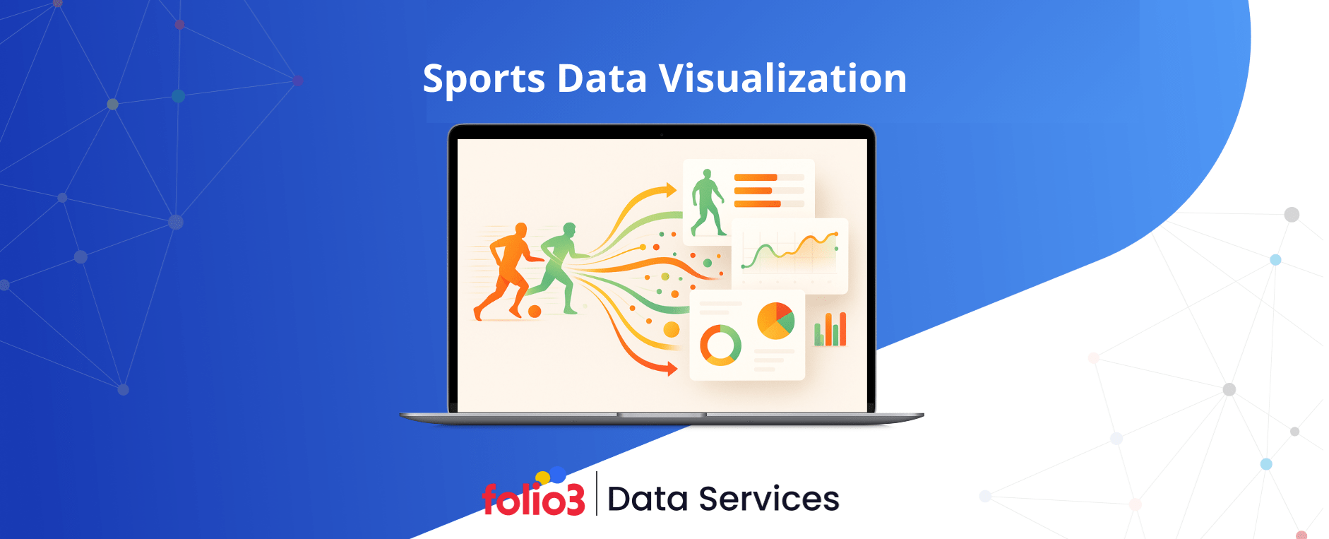
What is Sports Data Visualization?
Sports data visualization represents the method of turning complex athletic statistics and measurements into visual formats like charts, graphs, heat maps, and interactive dashboards. This practice helps coaches, analysts, players, and fans understand patterns and trends that would be impossible to spot in spreadsheets full of numbers.
The process starts with collecting data from various sources: wearable sensors on athletes, video tracking systems in stadiums, and manual stat recording during games. These numbers then get organized and transformed into visual representations that highlight important insights. A basketball coach can instantly see which areas of the court a player shoots most effectively from, or a soccer analyst can visualize exactly where defensive breakdowns occur.
Modern sports generate information at incredible rates. Every player movement, every ball touch, every acceleration creates a data point. Without visualization, this wealth of information remains locked away in databases, too overwhelming to process manually. Visual formats unlock these insights, making them accessible to everyone from professional analysts to casual fans watching from home.
The impact extends beyond just understanding past performance. Teams use these visuals to predict future outcomes, prepare strategies for upcoming opponents, and identify talented players who might otherwise go unnoticed. Sports data visualization has transformed from a luxury tool into a fundamental requirement for staying competitive in modern athletics.
Examples of Real-World Sports Data Visualizations
Professional sports teams and broadcasting networks have adopted numerous visualization techniques to extract meaning from their data collections. Each type serves specific purposes, from tracking player positioning to monitoring athlete health and recovery patterns.
Heat Maps for Player Movement
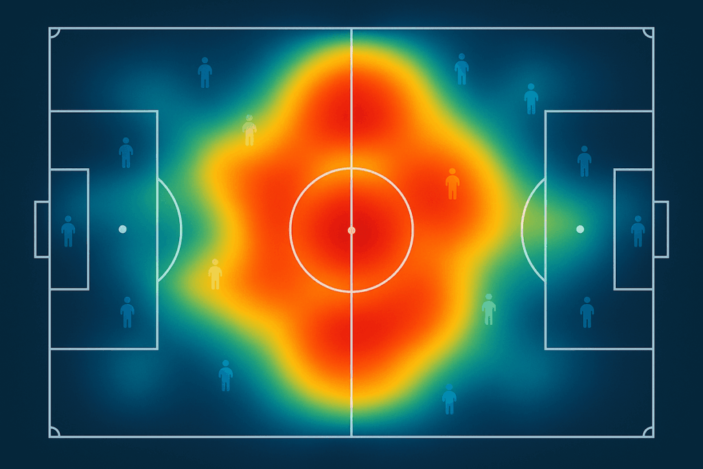
Heat maps display where athletes spend most of their time during competition using color gradients. In football, these visuals show defensive zones covered by individual players throughout a match. Basketball analysts use them to identify which court areas receive the most defensive pressure. Cricket teams track ball recovery zones and fielding patterns. These maps help coaches understand spatial dynamics and adjust positioning strategies accordingly.
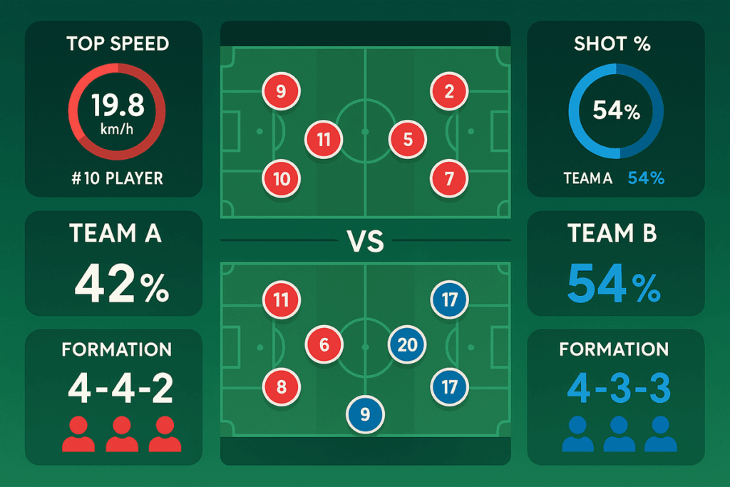
Shot Charts and Field Maps
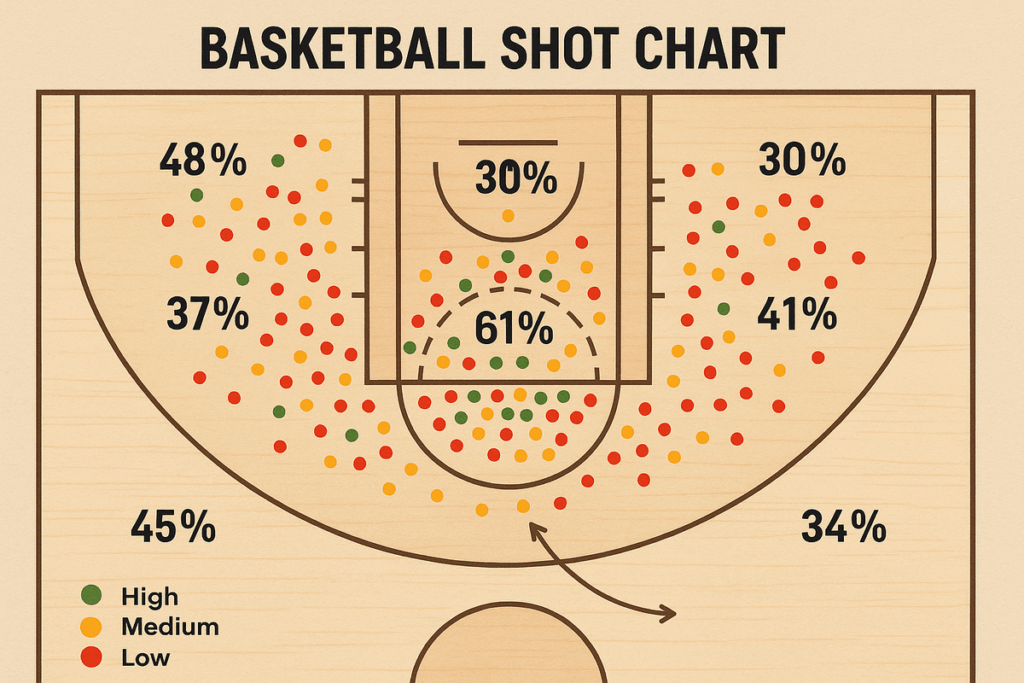
Basketball shot charts reveal shooting efficiency from different court locations, showing percentages for each area. Soccer uses expected goals (xG) maps to visualize shot quality and scoring probability from various positions. These tools help identify scoring patterns, defensive vulnerabilities, and optimal shooting positions. Coaches use this information to develop offensive plays and defensive schemes that exploit or protect specific areas.
Player Performance Dashboards
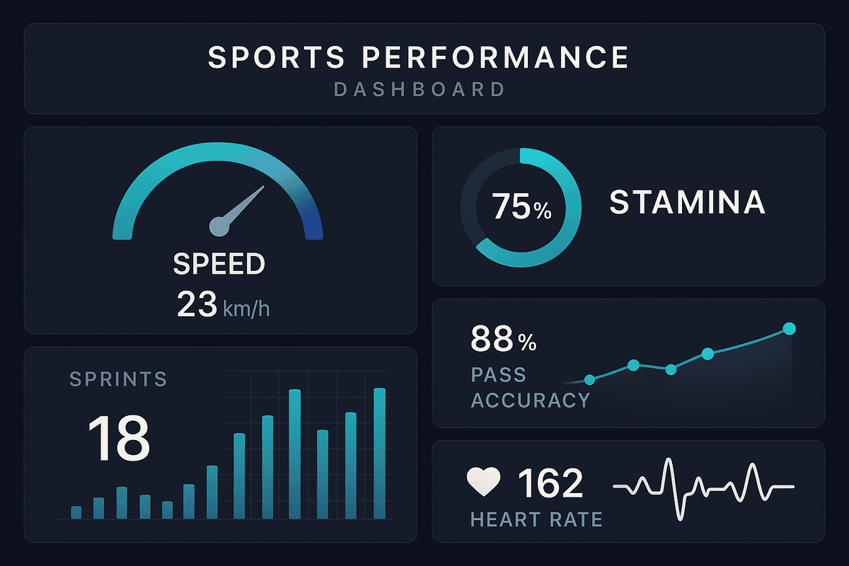
Performance dashboards compile multiple metrics into single-screen displays showing speed, stamina, sprint counts, and pass accuracy. Coaches and analysts monitor these measurements to evaluate player contributions beyond basic statistics. By implementing predictive analytics in sports, teams can combine historical data with real-time metrics to anticipate performance trends and optimize training programs.
Match Momentum Graphs
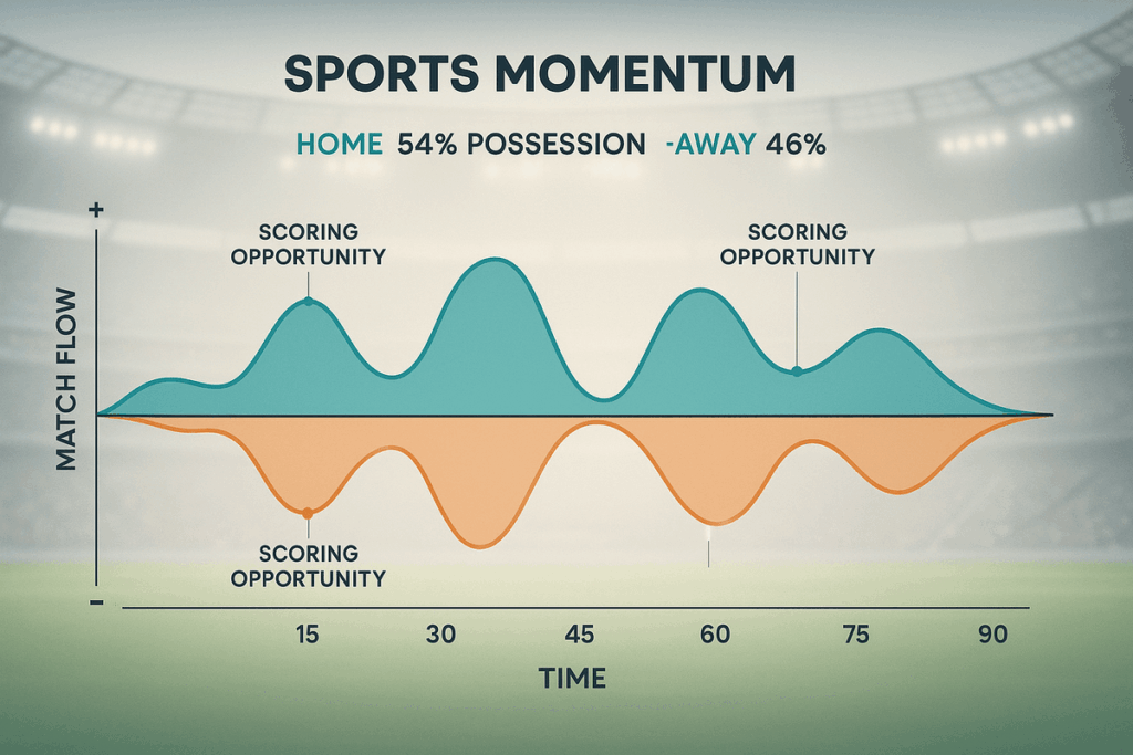
Momentum graphs track competitive flow over time, showing which team or player controls the contest at different moments. Tennis uses momentum waves to visualize service breaks and game-winning streaks. Football match dominance charts display possession, territorial control, and scoring chances throughout ninety minutes. These visuals help commentators explain game narratives and assist coaches in understanding when momentum shifted and why.
Injury and Workload Monitoring Charts
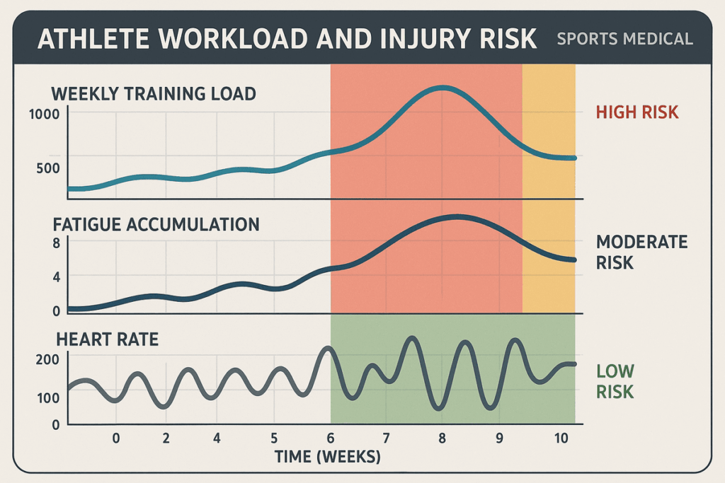
Sports medicine teams rely on workload monitoring charts displaying weekly training loads and fatigue accumulation. These visualizations show curves indicating when athletes approach dangerous fatigue levels that increase injury risk. GPS data combined with heart rate monitoring creates comprehensive pictures of physical stress. Medical staff intervene when charts indicate excessive strain, preventing injuries before they occur through data-driven rest and recovery protocols.
Fan-Facing Visualizations
Broadcasting networks integrate real-time statistics into game coverage, displaying shooting percentages, player speed comparisons, and tactical formations. League websites offer interactive dashboards where fans explore detailed statistics, compare players, and track season-long trends. These visualizations increase engagement by helping casual viewers understand strategic elements they might otherwise miss, deepening their connection to the sport and specific teams.
Best Tools and Tech for Visualizing Sports Data
Creating effective sports visualizations requires specialized software, analytical platforms, and technical infrastructure. The sports industry uses a combination of general business intelligence tools and sport-specific technologies to handle the unique challenges of athletic data analysis.
1) Data Analytics Platforms
Tableau and Power BI lead the business intelligence space for sports visualization, offering powerful yet accessible data visualization platforms for teams of all sizes. These platforms democratize data analysis by removing technical barriers while maintaining professional-grade capabilities.
Tableau
Tableau provides drag-and-drop visualization creation for sports analysts without programming expertise. Sports organizations appreciate its ability to connect multiple data sources and generate comprehensive visual reports quickly. The platform handles large datasets efficiently and creates interactive dashboards that update automatically. Teams use Tableau to build everything from player performance scorecards to fan engagement analytics.
Power BI
Power BI integrates seamlessly with Microsoft’s ecosystem, offering familiar interfaces for teams already using Office products. The platform excels at creating shareable reports that work across desktop and mobile devices. Sports organizations value its affordability and integration with Excel, making it accessible for smaller programs. Power BI’s natural language query feature allows coaches to ask questions in plain English and receive instant visual answers.
2) Visualization Software Tools
JavaScript libraries provide developers with complete control over custom sports visualizations, enabling unique fan experiences and specialized analytical interfaces that generic platforms cannot deliver.
D3.js
D3.js offers JavaScript developers complete control over custom interactive visualizations for web-based sports applications. Developers choose it for flexibility in creating unique visual experiences tailored to specific sports and metrics. The library powers many professional sports league websites, enabling complex animations and interactive elements. D3.js handles everything from simple bar charts to intricate network diagrams showing player passing relationships.
Chart.js
Chart.js provides simpler charting capabilities for teams needing straightforward graphs and charts without extensive coding. These libraries power many fan-facing statistics websites and mobile applications. The lightweight library loads quickly on mobile devices, making it ideal for real-time game statistics displays. Teams appreciate its responsive design features that automatically adapt charts to different screen sizes.
3) Business Intelligence Dashboards
Enterprise-grade business intelligence platforms combine on-field performance data with business operations, enabling sports organizations to make strategic decisions that span athletic and financial considerations. Implementing effective business intelligence strategies ensures that insights derived from these dashboards inform recruitment, training, and financial planning cohesively.
Qlik Sense
Qlik Sense uses associative data models that reveal relationships between different performance metrics automatically. The platform’s unique approach allows users to explore data connections without predefined queries or rigid report structures. Sports analysts discover unexpected correlations between training loads, injury patterns, and performance outcomes. The system highlights related data points as users make selections, guiding exploration toward meaningful insights.
Looker
Looker operates entirely in the cloud, making collaboration between coaching staff, analysts, and management seamless. These platforms excel at combining business operations data with on-field performance, helping front offices make holistic decisions about player acquisitions, contract negotiations, and resource allocation across departments. Looker’s modeling layer ensures everyone in the organization works from consistent definitions and calculations, preventing conflicting reports.
4) Performance Tracking Systems
Wearable technology systems have revolutionized how teams monitor athlete workload, movement patterns, and physical readiness, providing objective measurements that inform training and competition decisions.
Catapult Sports
Catapult Sports provides wearable GPS units and analysis software specifically designed for team sports training and competition. These systems measure acceleration, deceleration, metabolic power, and collision forces, capturing detailed sports performance metrics.
The accompanying software visualizes this data for coaches, helping optimize training intensity, monitor recovery, and make informed decisions based on actual physical demands. Professional leagues across soccer, rugby, and American football rely on Catapult’s technology to track and enhance athlete performance.
STATSports
STATSports offers similar tracking technology with specialized metrics for different sports categories. The system includes features specifically designed for return-to-play protocols after injuries, tracking gradual workload increases. Teams use STATSports data to compare players against position-specific benchmarks and league averages. The platform’s mobile app provides coaches with real-time alerts when athletes exceed safe training thresholds.
5) Statistical Analysis Tools
Programming languages and statistical packages enable advanced analysts to perform sophisticated modeling, custom calculations, and experimental visualizations beyond what commercial platforms offer.
R
R programming language offers extensive statistical packages popular among sports researchers and advanced analysts. University sports programs and research departments favor this open-source option for its flexibility and cost-effectiveness. The language excels at complex probability modeling, survival analysis for injury prediction, and hierarchical modeling for player evaluation. Thousands of contributed packages provide specialized functions for every analytical need.
Python (Pandas, Matplotlib)
Python with Pandas and Matplotlib libraries provides data manipulation capabilities and visualization creation in one environment. These tools handle complex statistical modeling, machine learning applications, and custom visual creation. Python’s readability makes it easier for analysts to share and maintain code across departments. The language integrates easily with databases, APIs, and web applications, creating end-to-end analytical pipelines.
6) Interactive Graphing Libraries
Modern web-based charting libraries transform static reports into interactive data visualization experiences where users control what they see, increasing engagement and enabling personalized analysis.
Plotly
Plotly creates interactive web-based visualizations that allow users to zoom, filter, and explore data dynamically. Sports websites use these libraries to engage fans with explorable data, allowing them to investigate player comparisons and historical trends independently rather than viewing static images. The library supports 3D visualizations for spatial data like shot locations and player positioning heat maps.
Highcharts
Highcharts offers similar functionality with emphasis on real-time updating capabilities for live game statistics. Broadcasting networks integrate Highcharts into their digital platforms for live match dashboards. The library handles high-frequency data updates without performance degradation, essential for tracking plays as they happen. Teams use Highcharts for in-stadium video boards displaying real-time player statistics.
7) Machine Learning Algorithms
Artificial intelligence frameworks enable predictive analytics, pattern recognition, and automated insights that would be impossible through manual analysis alone.
Scikit-learn
Scikit-learn provides classification and regression tools that predict outcomes and identify patterns in historical sports data. These frameworks power advanced scouting systems and predictive models. Teams use them to forecast player development, simulate game outcomes, and discover hidden patterns in opponent strategies. The library includes algorithms for clustering similar players, predicting injury risk, and optimizing lineup combinations.
TensorFlow
TensorFlow enables deep learning applications like video analysis for automatic play recognition and player tracking. Computer vision models built with TensorFlow can automatically tag video footage with events, eliminating hours of manual coding work. Teams use neural networks to predict shot success probability based on defensive positioning and shooter biomechanics. The framework supports training on GPU clusters for analyzing entire seasons of video data.
8) Real-Time Data Sensors
Wearable sensors provide continuous physiological and movement monitoring, creating comprehensive pictures of athlete status that inform immediate and long-term decisions.
GPS Trackers
GPS trackers worn by athletes provide continuous position and movement data throughout training sessions and games. Medical staff and coaches monitor athletes during activity, making immediate adjustments when sensors indicate concerning patterns. Modern GPS units update position 10 times per second, capturing rapid directional changes and acceleration patterns. Teams analyze GPS data to understand tactical positioning and identify when players drift from assigned roles.
Heart Rate Monitors
Heart rate monitors supply physiological information about exertion levels and recovery status. These sensors feed data directly into visualization platforms, enabling instant feedback. Coaches use heart rate zones to ensure training sessions achieve intended intensity targets. Medical teams monitor heart rate variability as an indicator of recovery status and readiness to train.
9) Video Analysis Software
Video platforms with integrated statistical capabilities bridge the gap between what analysts see in numbers and what coaches and players experience on the field.
Hudl
Hudl combines video footage with statistical overlays, allowing coaches to review plays with relevant metrics displayed directly on screen. These platforms transform video archives into searchable databases tagged with statistical events, making it easy to find specific situations and visualize performance in context. High school and college programs particularly value Hudl’s affordability and ease of use for building video libraries.
Dartfish
Dartfish provides motion analysis tools that break down technique and biomechanics through annotated video. Coaches use frame-by-frame analysis with drawing tools to illustrate proper technique and identify mechanical flaws. The software measures angles, velocities, and distances directly on video footage. Individual sport athletes in golf, tennis, and track and field rely on Dartfish for technique refinement.
10) Cloud Data Solutions
Cloud computing platforms provide the infrastructure necessary to store, process, and serve massive amounts of sports data without requiring organizations to build and maintain physical data centers.
AWS
AWS provides scalable storage and computing power necessary for processing massive sports datasets rapidly. Cloud platforms enable organizations to store years of historical data, run complex analyses, and serve visualizations to global audiences without maintaining expensive physical infrastructure. Major sports leagues use AWS for streaming video analytics and fan-facing statistics websites that must handle millions of concurrent users.
Google Cloud
Google Cloud offers machine learning services and data warehousing capabilities suited to sports analytics workloads. Teams use BigQuery for analyzing petabytes of historical tracking data with SQL queries that complete in seconds. Google’s AutoML tools allow analysts without deep learning expertise to build custom prediction models. The platform’s global network ensures fast visualization loading times for international audiences.
Key Benefits of Sports Data Visualization
Visual representation of sports data delivers substantial advantages across multiple aspects of athletic competition, from improving individual player development to creating more engaging experiences for global audiences.
1. Improved Performance Insights
Visualization reveals patterns that remain invisible in raw numbers, showing exactly where athletes excel or struggle. Coaches identify technical flaws, tactical weaknesses, and physical limitations through visual analysis. Players understand their own performance more clearly when seeing visual feedback compared to reading numerical reports. This clarity accelerates improvement by focusing training efforts on specific, visually demonstrated needs.
2. Real-Time Game Analysis
Modern visualization tools update during live competition, giving coaching staffs immediate tactical intelligence. Assistants monitor dashboards tracking substitution patterns, fatigue indicators, and matchup effectiveness while games unfold. This real-time insight enables quick strategic adjustments that can determine game outcomes. Broadcasting teams use similar technology to provide viewers with up-to-the-second analysis during telecasts.
3. Enhanced Coaching Decisions
Visual data helps coaches make objective personnel decisions rather than relying solely on intuition or incomplete observations. Lineup selections, substitution timing, and tactical adjustments become data-informed through dashboard monitoring. Coaches justify decisions to players and management using visual evidence, reducing conflicts and building trust. Practice planning benefits from identifying which skills require additional development based on visual performance breakdowns.
4. Better Player Evaluation
Scouting departments use visualizations to assess prospects and opponents more accurately than traditional methods allow. Shot charts, movement patterns, and efficiency metrics reveal player value beyond basic statistics. Teams discover undervalued athletes who excel in specific areas that align with organizational needs. Contract negotiations incorporate visual performance evidence, ensuring fair compensation based on measurable contributions.
5. Faster Trend Discovery
Automated visualization systems spot emerging patterns before human analysts notice them in raw data. The adoption of big data in sports allows teams to identify trends early and adjust strategies accordingly. Injury prediction algorithms visualize risk factors, enabling preventive interventions. Performance trends over seasons help identify aging curves and optimal contract lengths, informing long-term roster construction.
6. Audience Engagement Boost
Fans understand games more deeply when broadcasts include accessible visualizations explaining complex strategies and player contributions. Interactive statistics on team websites keep supporters engaged between games, building loyalty. Fantasy sports enthusiasts use visual data to make informed decisions, creating additional revenue streams. Enhanced engagement translates to increased viewership, merchandise sales, and overall franchise value.
Here’s a comprehensive comparison table for the sports data visualization types:
Comparing Sports Data Visualization Types
Different visualization formats serve distinct analytical purposes, each with specific strengths and ideal applications within sports analytics contexts.
| Visualization Type | Primary Use Case | Key Strengths | Limitations | Best For | Complexity Level |
| Heat Maps | Spatial distribution analysis | Shows positioning tendencies, coverage areas, and movement frequency through color intensity | Cannot show temporal changes or multiple data dimensions simultaneously | Analyzing defensive zones, offensive spacing, and player movement patterns | Medium |
| Line Charts | Performance trends over time | Universally understood, tracks improvement or decline across seasons or careers | Cannot show spatial relationships or multiple simultaneous metrics | Tracking player/team progress and historical performance comparisons | Low |
| Bar Charts | Category comparisons | Simple, clear comparisons of discrete categories; minimal explanation needed | Limited to single-dimension comparisons; no spatial or temporal context | Comparing player statistics, team rankings, or game-by-game results | Low |
| Radar Charts | Multi-attribute player profiles | Displays multiple attributes simultaneously; shows relative strengths and weaknesses at a glance | Becomes cluttered with more than 6-8 attributes; difficult to compare multiple players | Scouting reports, comprehensive player evaluations, skill assessments | Medium |
| Scatter Plots | Relationship analysis | Reveals correlations and outliers; identifies players with rare attribute combinations | Requires more interpretation; limited effectiveness with non-technical audiences | Efficiency metrics, finding undervalued players, talent identification | Medium-High |
| Dashboards & Real-Time Displays | Comprehensive monitoring | Combines multiple visualization types; provides holistic views during live events | Can overwhelm viewers with information overload if poorly designed | Experienced analysts, coaching staff, in-game decision making | High |
How to Turn Sports Data into Visuals: 7 Easy Steps
Creating meaningful sports visualizations follows a systematic process that ensures the final product delivers clear insights rather than confusing clutter.
Step 1: Collect Relevant Data
Begin by identifying exactly what information you need to answer specific questions or evaluate particular aspects of performance. Gather data from appropriate sources including tracking systems, manual statistics, video analysis, or wearable sensors.
Many insights are enhanced when working with a sports analytics company, which can provide structured datasets and expert guidance on relevant metrics. Ensure data collection methods are consistent and reliable. Avoid gathering unnecessary information that clutters analysis without adding value. Focus on metrics directly related to your visualization goals.
Step 2: Clean and Organize Data
Raw data contains errors, missing values, and inconsistencies that must be addressed before visualization. Remove duplicate entries, correct obvious mistakes, and standardize formats across datasets. Fill gaps using appropriate methods or remove incomplete records if necessary. Organize information into logical structures that your chosen visualization tools can process efficiently. Poor data preparation undermines even the best visualization designs.
Step 3: Define Objectives
Clearly articulate what question your visualization should answer or what insight it should reveal. Different objectives require different visual approaches. A coaching staff preparing for opponents needs different visuals than a medical team monitoring injury risk. Write down specific goals before selecting formats or creating designs to maintain focus throughout the process.
Step 4: Choose Visualization Type
Select the format that best communicates your specific insight to your target audience. Consider whether spatial relationships, temporal trends, comparisons, or distributions matter most for your objective.
Reviewing best data visualization examples from professional sports can help determine which type effectively conveys the intended message. Match complexity to audience expertise levels. Technical analysts can interpret sophisticated multi-dimensional displays while casual fans require simpler formats. The right visualization type makes insights obvious.
Step 5: Select Tools
Choose software or platforms based on your technical skills, budget, and required functionality. Simple charts may need only spreadsheet software while complex interactive dashboards require specialized platforms. Consider whether visuals will be static reports or dynamic updating displays. Ensure selected tools can handle your data volume and update frequency requirements.
Step 6: Create Visuals
Build your visualization following design best practices: clear labels, appropriate color schemes, readable fonts, and intuitive layouts. Test different versions to find the most effective presentation. Remove unnecessary decorative elements that distract from core insights. Ensure visuals work across different viewing contexts including presentations, mobile devices, and large stadium displays.
Step 7: Interpret and Share Insights
Accompany visualizations with clear explanations of what patterns mean and what actions they suggest. Present findings to stakeholders using language appropriate to their expertise levels. Provide context about data limitations and confidence levels. Make visuals accessible through appropriate channels whether coaching software, team websites, or broadcast graphics. Follow up to ensure audiences understand and can apply insights effectively.
Challenges in Sports Data Visualization and How to Solve Them
Creating effective sports visualizations presents several common obstacles that require strategic approaches to overcome successfully.
Data Quality
Inconsistent collection methods, human recording errors, and equipment malfunctions compromise data reliability. According to research published in Machine Learning journal, data quality issues are present in optical tracking data due to player occlusions and low-resolution camera setups, leading to errors that propagate to derived metrics like speed and acceleration.
Solution: Use robust data engineering and integration protocols that automatically flag suspicious values, consolidate multiple data sources for verification, and establish consistent collection standards. Regular audits of data pipelines catch systemic issues before they impact analyses.
Visualization Overload
Cramming too much information into single displays creates confusion rather than clarity. Audiences struggle to extract meaningful insights when faced with overwhelming visual complexity.
Solution: Focus each visualization on answering one specific question or revealing one clear pattern. Create multiple simple visuals rather than one complicated display. Use progressive disclosure where users can drill down into details when needed.
Interpretation Barriers
Non-technical audiences struggle to understand sophisticated statistical visualizations without proper context and explanation. Complex metrics like expected goals or player efficiency ratings require background knowledge.
Solution: Include clear legends, annotations, and brief explanatory text with visualizations. Provide training sessions for coaching staffs and stakeholders. Create tiered visualization systems with simplified versions for general audiences and detailed versions for analysts.
Integration Limits
Sports organizations use multiple disconnected systems for different data types, making comprehensive visualization difficult. GPS tracking, video analysis, and manual statistics often exist in separate databases.
Solution: Invest in integration platforms that connect disparate data sources into unified systems. Establish data standards across departments ensuring compatibility. Consider cloud-based solutions that facilitate data sharing between systems and stakeholders.
5 Best Practices in Sports Data Visualization
Following established principles ensures sports visualizations communicate effectively and drive better decisions across organizations. Using advanced data visualization techniques helps achieve clarity and actionable insights.
1) Keep Visuals Simple and Focused
Each visualization should address one clear question or reveal one specific pattern without unnecessary complexity. Limit the number of data series, colors, and elements competing for attention. Simple designs communicate faster and reduce misinterpretation risks. If a visualization requires extensive explanation, it probably needs simplification. Test designs with target audiences to ensure immediate comprehension.
2) Use the Right Chart for the Data
Match visualization format to data structure and communication goals. Time-based trends require line charts, categorical comparisons need bar charts, spatial patterns demand heat maps. Forcing data into inappropriate formats obscures insights rather than revealing them. Learn the strengths and limitations of each visualization type. Consider multiple options before finalizing designs to find the most effective approach.
3) Ensure Data Accuracy
Incorrect visualizations are worse than no visualizations because they inspire false confidence in wrong conclusions. Implement verification processes checking calculations, data connections, and update mechanisms. Test visualizations against known results before deployment. Establish clear ownership and accountability for data quality. Regular audits catch errors that slip through initial reviews, maintaining trust in analytical systems.
4) Make Visuals Interactive
Interactive elements like filters, drill-downs, and dynamic date ranges increase engagement and enable personalized exploration. Users extract more value when they control what aspects of data they examine. Interactive dashboards serve diverse stakeholders with different priorities from single platforms. However, ensure core insights remain visible without interaction for quick scanning. Balance interactivity with simplicity.
5) Highlight Actionable Insights
The best visualizations guide viewers toward specific conclusions or decisions rather than leaving interpretation completely open. Use annotations, callouts, and visual emphasis to draw attention to important patterns. Accompany visuals with brief recommendations or questions they raise. Connect visualizations directly to decisions they should inform, making the path from data to action clear for all stakeholders.
Case Studies: Sports Data Visualization Success Stories
Several professional sports organizations have achieved remarkable success by effectively implementing data visualization strategies that transformed their competitive performance.
1. Liverpool FC (Soccer / Football)
Liverpool’s analytical department revolutionized their tactical approach by visualizing expected goals (xG), pressing intensity metrics, and comprehensive player tracking data. These visualizations helped coaching staff understand which pressing patterns forced the most turnovers and which formations created the highest quality scoring chances.
The recruitment team used visual player profiles comparing candidates across multiple attributes, identifying undervalued talent whose playing styles matched their tactical system perfectly. This data-driven approach contributed directly to winning the Premier League and Champions League titles.
2. Golden State Warriors (Basketball / NBA)
The Warriors transformed basketball strategy by visualizing shot efficiency data that revealed three-point and corner shots provided far better value than mid-range attempts. Analytics staff created heat maps showing shooting percentages from every court location, convincing coaches to fundamentally alter offensive philosophy.
They visualized defensive matchup data, optimizing switching schemes and player combinations. Performance tracking dashboards monitored player workload, preventing injuries through data-informed rest patterns. This visualization-enabled strategy helped secure multiple championships and changed how the entire league approaches offense.
3. Leicester City F.C. (Soccer / Premier League)
Leicester’s improbable 2015-16 Premier League title victory relied heavily on sophisticated data visualization tools despite limited financial resources compared to competitors. Their analytics team visualized scouting data to identify undervalued players who fit specific tactical requirements.
Performance monitoring dashboards tracked player fitness levels and workload, optimizing training intensity and preventing injuries to key personnel. Match preparation involved visualizing opponent tendencies, allowing Leicester to exploit weaknesses systematically. Data visualization enabled them to compete strategically against wealthier clubs.
4. Generic Use Cases Across Sports: Performance and Tactics Optimization
Beyond specific teams, data visualization has become standard practice across professional sports for multiple applications. Teams visualize tracking data showing player positioning, creating tactical adjustments that exploit space more effectively.
Ball possession patterns visualized over full matches reveal momentum shifts and tactical vulnerabilities. Physical and biometric data displayed on monitoring dashboards prevent overtraining and reduce injury rates. Behind the scenes, visualization tools support recruitment decisions, talent identification, match preparation, and long-term strategic planning across organizations at every competitive level.
Future Trends in Sports Data Visualization
Emerging technologies promise to further transform how sports organizations and fans interact with athletic data in coming years.
AI and Machine Learning Integration
Artificial intelligence will automate insight discovery, scanning massive datasets to identify patterns humans might miss entirely. Machine learning algorithms will generate visualizations automatically based on current context, highlighting the most relevant metrics for specific situations.
Predictive visualizations will show likely future outcomes based on current trajectories, helping coaches make proactive adjustments. Natural language interfaces will allow users to request specific visualizations using conversational questions rather than manual configuration.
Real-Time Predictive Analytics
Future systems will visualize not just current status but also projected outcomes as games unfold. Win probability graphs will update continuously based on current game state and historical patterns. Injury risk indicators will provide real-time warnings when athlete biometrics approach dangerous thresholds.
Tactical effectiveness displays will show predicted results of different strategic options, enabling data-informed in-game decisions with confidence about probable consequences.
Augmented Reality Visualizations for Fans
Stadium attendees will access augmented reality overlays on smartphones or glasses displaying player statistics, tactical formations, and real-time analytics superimposed on their view of the action. Fans will see personalized data relevant to their interests, from fantasy football statistics to betting odds. Training facilities will use AR to visualize optimal positioning and movement patterns directly on playing surfaces, accelerating player development through immersive feedback.
Interactive Dashboards
Next-generation dashboards will adapt to user preferences and roles automatically, showing relevant metrics for coaches, medical staff, scouts, and executives without manual configuration. Voice control and gesture interfaces will make dashboard interaction seamless during games when hands and attention are occupied. Collaborative features will allow distributed coaching staffs to annotate and discuss visualizations remotely in real-time, improving coordination for global organizations.
FAQs
What is Sports Data Visualization?
Sports data visualization is the process of converting athletic performance metrics, game statistics, and player tracking information into visual formats like charts, graphs, heat maps, and dashboards that make patterns and insights easier to understand and act upon.
What are the Best Examples of Sports Data Visualization?
The best examples include basketball shot charts showing shooting efficiency by court location, soccer heat maps displaying player movement patterns, tennis momentum graphs tracking competitive flow, and comprehensive performance dashboards monitoring multiple metrics simultaneously for coaching decisions.
How Do I Turn Sports Data into Visuals?
Turn sports data into visuals by first collecting relevant information, cleaning and organizing it, defining clear objectives, choosing appropriate visualization types for your goals, selecting suitable software tools, creating the actual visuals, and finally interpreting and sharing insights with stakeholders.
How Does Sports Analytics Benefit from Data Visualization?
Sports analytics benefits from data visualization by making complex patterns immediately apparent, enabling faster decision-making during games, improving communication between analysts and coaches, identifying trends that would remain hidden in spreadsheet data, and making insights accessible to non-technical stakeholders throughout organizations.
Which Metrics are Most Important to Visualize in Sports Performance Analysis?
The most important metrics to visualize include player positioning and movement patterns, physical workload and fatigue indicators, shooting or scoring efficiency from different locations, defensive pressure and coverage areas, speed and acceleration data, and injury risk factors based on accumulated training loads.
Can Coaches Use Sports Data Visualization to Improve Team Strategy?
Yes, coaches use sports data visualization extensively to improve team strategy by identifying opponent weaknesses through pattern analysis, optimizing player positioning based on heat maps, making substitution decisions using real-time performance dashboards, and developing tactical plans informed by statistical trends and probabilities.
How Do Interactive Dashboards Enhance Sports Data Insights?
Interactive dashboards enhance sports data insights by allowing users to filter information based on specific situations, drill down into detailed metrics for particular players or moments, compare different time periods or opponents, and explore personalized views relevant to individual roles without overwhelming everyone with irrelevant data.
How Can Sports Organizations Track Player Performance Using Visuals?
Sports organizations track player performance using visuals through wearable sensor data displayed on monitoring dashboards, video analysis software that overlays statistics on footage, trend charts showing improvement or decline over time, comparison visualizations, benchmarking athletes against teammates or league standards, and comprehensive profile displays.
What are the Challenges of Visualizing Large Sports Datasets?
Challenges of visualizing large sports datasets include maintaining data quality across multiple collection sources, avoiding information overload that confuses rather than clarifies, ensuring visualizations load and update quickly despite dataset size, integrating data from disconnected systems, and creating displays that remain comprehensible while showing sufficient detail.
How Do Advanced Analytics and Machine Learning Improve Sports Visualizations?
Advanced analytics and machine learning improve sports visualizations by automatically discovering hidden patterns in massive datasets, generating predictive displays showing likely future outcomes, adapting visualizations to current context and user needs, processing video footage to create automated tracking visualizations, and identifying optimal visualization formats for specific insights.
Which Tool is Best for Sports Data Visualization?
The best tool for sports data visualization depends on specific needs: Tableau and Power BI work well for general business intelligence and dashboard creation, Python with Matplotlib suits custom analytical work, specialized platforms like Catapult Sports handle athlete tracking, while D3.js enables custom interactive web visualizations.
Is Tableau Good for Sports Analytics?
Yes, Tableau is excellent for sports analytics because it handles large datasets efficiently, creates interactive dashboards without programming requirements, integrates with multiple data sources easily, updates visualizations automatically as new data arrives, and provides intuitive interfaces that make insights accessible to non-technical coaching staff and management.
Which Python Libraries are Best for Sports Data Dashboards?
The best Python libraries for sports data dashboards include Pandas for data manipulation and preparation, Matplotlib and Seaborn for creating static visualizations, Plotly for interactive web-based graphs, Dash for building complete dashboard applications, and Streamlit for rapid prototyping of analytical interfaces with minimal code requirements.
Conclusion
Sports data visualization has evolved from a competitive advantage into an essential requirement for modern athletic organizations at every level. The ability to transform massive data streams into clear visual insights separates winning programs from those left behind.
As technology continues advancing, visualization tools will become even more sophisticated, making data-driven decision-making accessible to organizations regardless of budget or technical expertise. Teams that embrace visual analytics gain not just better performance insights but also deeper connections with fans who appreciate understanding the strategic complexity behind athletic competition.
Folio3 Data Services specializes in transforming raw sports data into actionable visual intelligence through our comprehensive analytics solutions. Our team combines deep technical expertise in data engineering, cloud infrastructure, and visualization platforms with understanding of sports analytics requirements.
We help organizations implement end-to-end data visualization systems – from sensor data collection and cloud storage architecture to custom dashboard development and analyst training. Whether you need real-time game analytics, player performance monitoring, or fan-facing interactive statistics, Folio3 delivers scalable solutions built on industry-leading platforms like Snowflake, AWS, and Microsoft Azure. Contact us to discover how data visualization can elevate your organization’s competitive performance.