
Organizations are producing more information than ever before, from customer interactions and transactions to IoT sensors and digital systems.
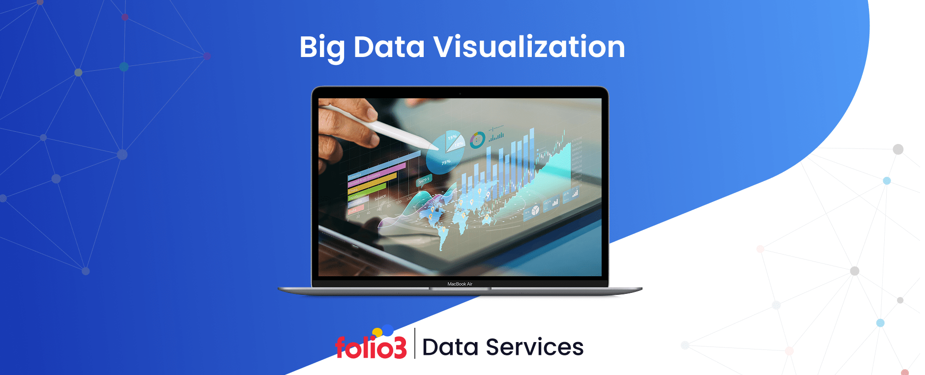
The challenge, however, lies not in data collection but in understanding and leveraging it effectively. This is where big data visualization becomes indispensable. It transforms vast, complex datasets into clear visual narratives that reveal hidden patterns, trends, and correlations, empowering faster and more accurate decision-making.
By bridging the gap between big data and data visualization, businesses can convert overwhelming raw data into actionable insights that inform strategic decisions. Modern big data visualization tools such as Tableau, Power BI, and Apache Superset enable organizations to build interactive dashboards, dynamically explore data, and democratize analytics across teams.
These tools not only simplify data interpretation but also foster data-driven cultures where insights are accessible and actionable.
Big data visualization turns information into intelligence. It ensures that every data point contributes to understanding the bigger picture, helping businesses innovate, optimize their operations, and make informed decisions in real-time.
In this blog, we’ll explore everything you need to know about big data visualization.
What is Big Data Visualization & Why Is It Crucial?
Big data visualization is the process of converting massive, complex datasets into visual formats such as charts, maps, or dashboards that humans can quickly interpret and act upon. Unlike traditional visualization methods that handle structured data within spreadsheets or small databases, big data visualization deals with diverse, high-volume information that requires advanced infrastructure and specialized tools to process effectively.
The significance of visualization lies in its ability to make complex ideas more comprehensible. According to a McKinsey report, organizations that excel at data-driven decision-making are 23 times more likely to acquire customers and 19 times more likely to achieve above-average profitability.
Yet, 67% of executives still struggle to accurately interpret their data. Big data analytics visualization addresses this gap by transforming raw numbers into visual narratives that drive understanding and action.
Humans process images up to 60,000 times faster than text. This explains why a well-designed dashboard can communicate insights instantly, whether it’s a supply chain manager spotting delivery bottlenecks on a heat map or a healthcare administrator identifying patient surges through business intelligence reporting and time-series graphs.
At its core, the visualization of big data serves three essential functions:
- It accelerates pattern recognition across massive, unstructured datasets.
- It democratizes insights by making analytics accessible to non-technical stakeholders.
- It enables real-time decision-making by visualizing live data streams.
Together, big data and data visualization have redefined how organizations operate. Rather than relying solely on historical reports, modern visualization systems combine advanced analytics and real-time data to reveal not just what happened—but what’s happening now and what’s likely to happen next.
Big Data Visualization Architecture & Workflow
Behind every powerful big data visualization lies a robust architecture that enables raw data to evolve into meaningful insights. This architecture forms the backbone of modern analytics systems, ensuring that data flows seamlessly from collection to visualization.
Let’s explore each layer of this workflow to understand how visualization fits into the broader data ecosystem.
1. Data Sources & Collection
The journey begins at the data source. Organizations collect massive volumes of information from IoT sensors, APIs, databases, and streaming applications. Whether it’s temperature readings from innovative farming equipment or transaction data from e-commerce platforms, this layer captures both structured and unstructured data. The accuracy and diversity of collected data directly influence the quality of subsequent visualization of big data.
2. Data Storage Layer
Once gathered, the data is moved into centralized repositories, such as data lakes or data warehouses. These systems form the core of big data storage, ensuring that raw and structured information is efficiently managed and readily available for analysis.
Data lakes store unprocessed data in its native format, ideal for flexible exploration, while warehouses hold cleaned and structured data optimized for querying and reporting. This dual-layer approach ensures scalability, accessibility, and long-term retention, forming the foundation for big data analytics visualization.
3. Data Processing & Transformation
Raw data rarely arrives in a usable form. Through ETL and ELT pipelines and real-time streaming frameworks, data is cleansed, standardized, and enriched for analysis and interpretation. Technologies like Apache Spark or AWS Glue efficiently handle massive data volumes, enabling real-time insights that are fed into visualization dashboards. This is where information begins its transformation from raw inputs to actionable intelligence.
4. Analytics & Modeling Layer
At this stage, machine learning algorithms, predictive analytics, and statistical models are employed. Businesses identify patterns, detect anomalies, and forecast trends. For example, a retail company might model seasonal sales patterns, while a manufacturer could predict equipment failure.
The results of these analyses serve as the foundation for visual dashboards and reports, making complex findings easy to understand and interpret.
Modern data analytics services and solutions often support this layer by providing scalable tools and expertise to manage advanced modeling and ensure accurate insights.
5. Visualization & Delivery
Finally, insights are delivered through intuitive dashboards, charts, and reports. Tools like Tableau, Power BI, or Apache Superset translate data into interactive visuals, enabling real-time monitoring and informed decision-making. This stage turns analytics into stories in helping decision-makers understand what’s happening, why it’s happening, and what to do next.
Types of Big Data Visualization with Examples
The strength of big data visualization lies in its ability to present massive and complex datasets in a way that is easy to interpret. From simple bar charts to advanced interactive dashboards, each visualization type serves a unique analytical purpose.
Exploring different data visualization examples helps organizations understand which methods best highlight trends, patterns, or correlations within their data.
The key is to choose the right visualization format that aligns with the data’s nature and the insights you aim to uncover. Below are the most common and impactful types of visualization of big data, along with real-world examples.
1. Charts and Graphs
Basic yet powerful, charts and graphs are the foundation of big data analytics visualization. They play a critical role in shaping an effective business intelligence strategy by turning raw numbers into easily interpretable visuals.
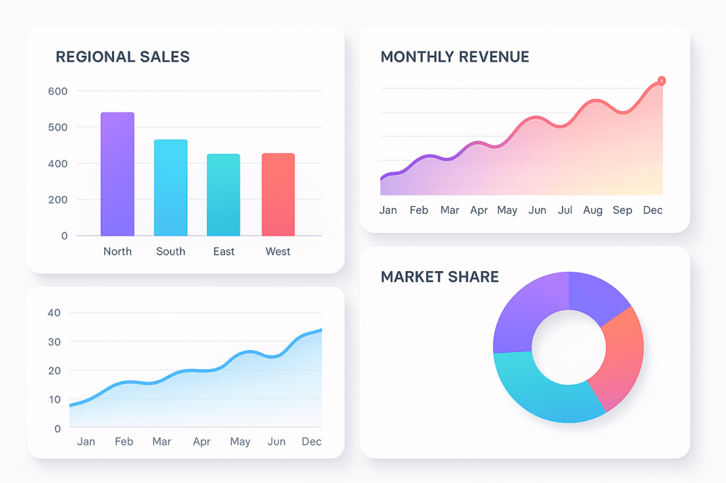
- Bar Charts and Column Charts: Ideal for comparing categories such as regional sales or customer segments. For example, an e-commerce company might use a bar chart to visualize monthly revenue across different markets.
- Line Charts for Trends: Perfect for showing changes over time, such as stock market performance or temperature variation across seasons.
- Pie Charts and Donut Charts: Useful for showing proportions or market share distribution.
- Area Charts: Combine line and filled regions to highlight cumulative data, such as total energy consumption or sales growth over time.
2. Advanced Plot Types
When data relationships become complex, advanced plots reveal more profound insights.
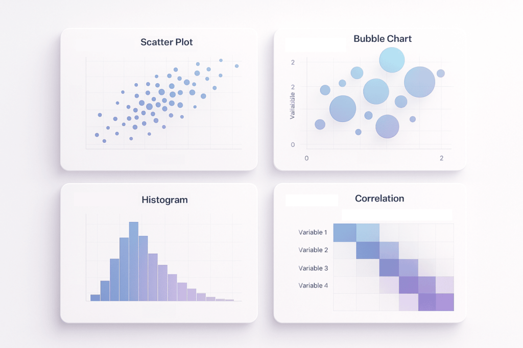
- Scatter Plots and Bubble Charts: Show correlations between variables, such as advertising spend vs. revenue.
- Histograms and Distribution Plots: Display frequency distributions helpful in understanding customer age ranges or product demand spread.
- Box Plots and Violin Plots: Represent data spread and outliers, often used in financial risk modeling or quality control analysis.
3. Geographic Visualizations
Geospatial data adds another dimension to big data visualization.
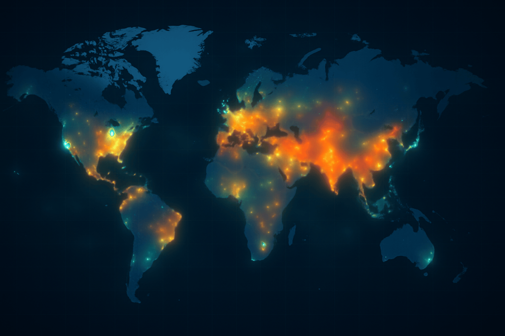
- Heat Maps: Represent intensity, like visualizing disease outbreaks or retail foot traffic.
- Geographic and Choropleth Maps: Display regional differences, such as income levels or agricultural yield by area.
- Location-Based Visualizations: Used for logistics optimization or tracking vehicle fleets in real time.
4. Hierarchical Visualizations
These methods help analyze relationships and nested structures within data.
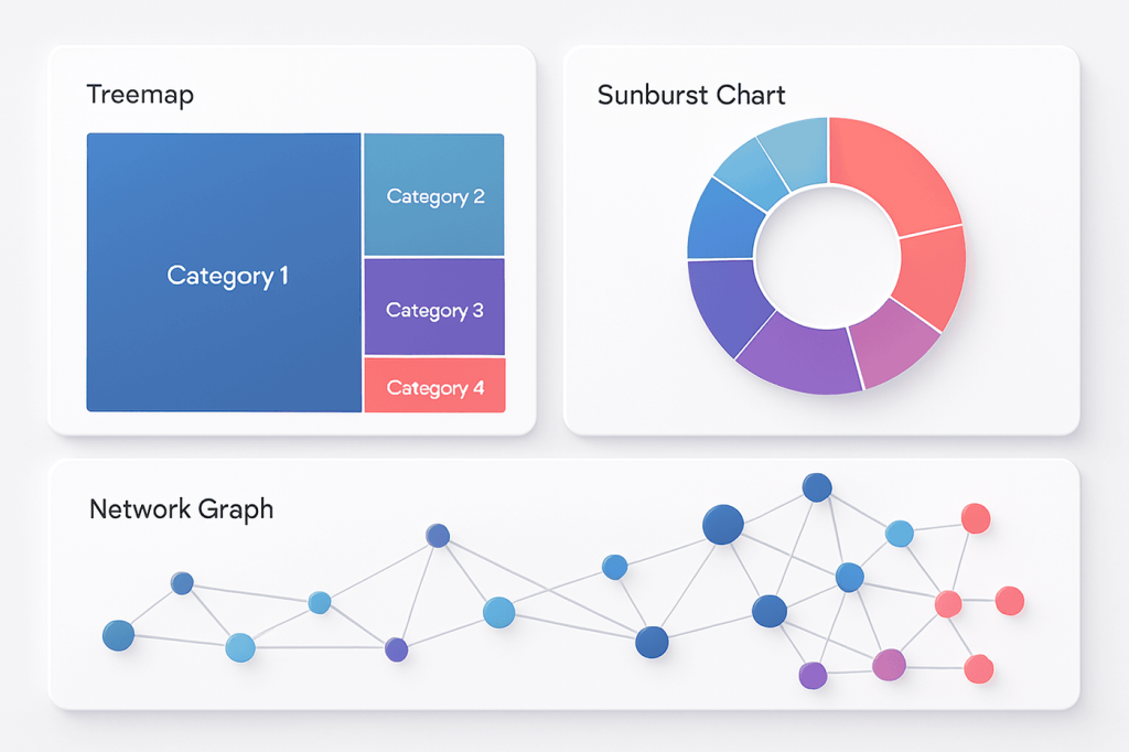
- Treemaps and Sunburst Diagrams: Display hierarchical proportions, often used in product portfolio or website traffic analysis.
- Network Graphs: Map connections between entities, such as social networks or supply chain dependencies.
- Dendrograms: Commonly used in bioinformatics or machine learning to visualize clustering relationships.
5. Time-Series Visualizations
Time-based data requires tools that can track change dynamically.
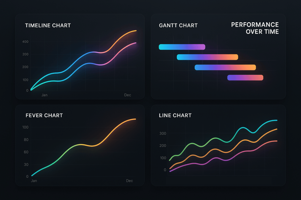
- Timeline Charts: Highlight milestones or historical performance trends.
- Fever Charts: Showcase real-time fluctuations like website traffic or energy consumption.
- Gantt Charts: Essential for project management and operational planning.
6. Interactive Dashboards
Modern big data analytics visualization goes beyond static charts, where interactive data visualization brings insights to life.
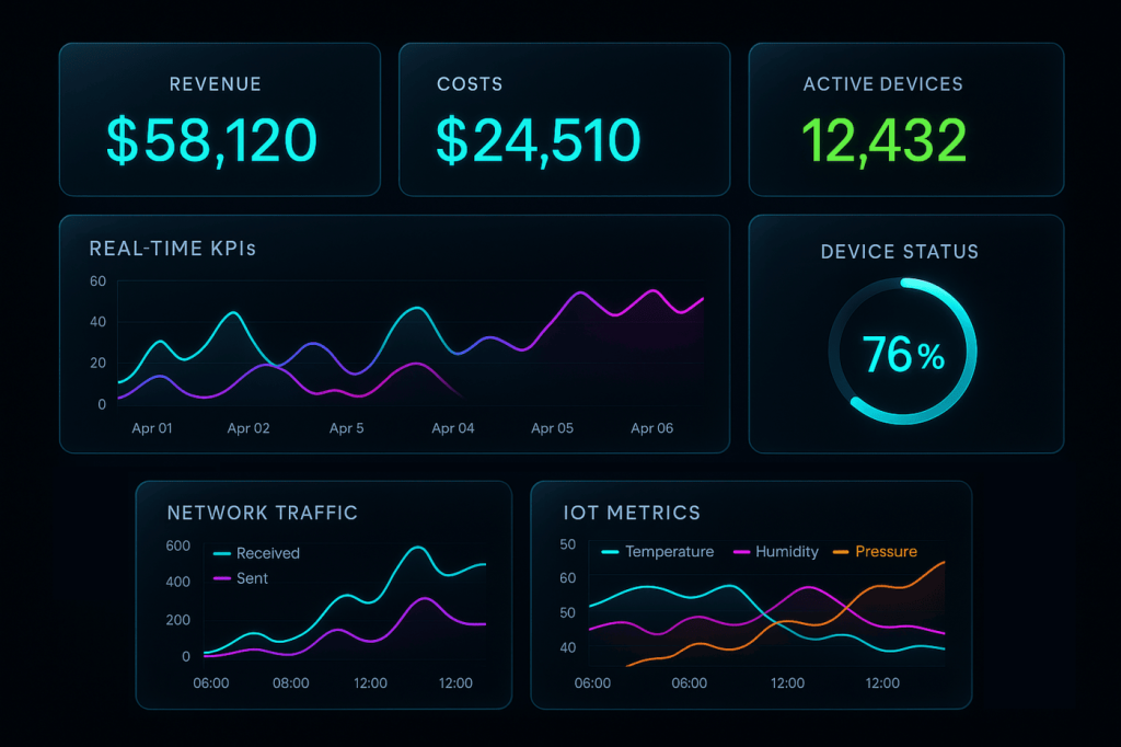
- Real-Time Monitoring Dashboards: Used in IoT and manufacturing to track equipment performance instantly.
- KPI Dashboards: Display business metrics such as conversion rates, churn, or productivity.
- Executive Dashboards: Offer high-level overviews across departments, enabling faster and more informed decision-making.
Big Data Visualization Use Cases & Examples by Industry
Big data visualization has become an essential part of modern analytics strategies across industries. It helps organizations uncover patterns, predict outcomes, and make faster, data-driven decisions.
By combining advanced analytics with real-time visualization, businesses can translate overwhelming datasets into actionable insights that improve efficiency and competitiveness. Below are some of the most impactful big data visualization examples across different sectors.
1. Healthcare – Predictive Insights for Improved Patient Outcomes
Healthcare organizations are increasingly relying on healthcare big data analytics and visualization to enhance patient care and operational efficiency. For example, Providence St. Joseph Health integrated data from multiple systems, including sensors, patient records, and weather data, to predict staffing needs and bed availability.
Interactive dashboards provided a unified view of hospital performance, enabling clinicians to reduce waste, lower costs, and enhance the quality of care. This visualization of big data enabled data transparency, driving measurable improvements in both patient outcomes and cost reduction.
2. Finance & Banking – Real-Time Fraud Detection and Risk Analysis
In the financial sector, MoneySQ, a fintech company, has transformed decision-making by utilizing data visualization tools like Tableau. Previously, financial teams relied on manual data collection and weekly reporting, slowing down responses to market changes.
With real-time dashboards, MoneySQ now tracks transactions instantly, identifies fraud patterns, and reacts to market shifts daily. This agility has enhanced operational efficiency, collaboration, and risk management key competitive advantages in a volatile financial landscape.
3. Retail & E-Commerce – Optimizing Sales and Customer Experience
Companies leverage retail business intelligence and big data visualization to predict customer behavior, optimize supply chains, and deliver personalized shopping experiences. Aldo, a Canadian footwear brand, uses a service-oriented big data architecture to integrate payment, billing, and fraud detection systems.
During high-demand events like Black Friday, this integration ensures a seamless online experience while preventing system overloads and fraud attempts. Real-time dashboards visualize performance metrics, enabling Aldo to adjust inventory and promotions in real-time.
4. Manufacturing – Predictive Maintenance and Waste Reduction
Manufacturers leverage big data analytics visualization to track production processes and identify inefficiencies. Coopers Brewery, for instance, used predictive maintenance IoT sensor and process data to detect where beer was being wasted during production.
By visualizing performance trends across equipment, they pinpointed inefficiencies and optimized operations in reducing potential revenue losses by 70%. These insights turned intuition-driven decisions into precise, data-backed strategies that continuously improve production efficiency.
5. Transportation & Logistics – Smarter Fleet and Supply Chain Management
In logistics, DHL Supply Chain uses AI-driven visualization of big data to optimize fleet management and route planning. By integrating generative AI with IoT sensor data, DHL analyzes traffic, weather, and delivery demand in real time to enhance efficiency.
Through digital twin simulations, the company can test route configurations and predict maintenance needs without disrupting operations. These innovations, powered by big data visualization, enable DHL to reduce costs, improve delivery accuracy, and prepare for a future of autonomous logistics.
How to Visualize Big Data? – A Step-by-Step Guide
Successful implementation requires a structured approach to thinking about what you’re trying to achieve and how you’ll get there.
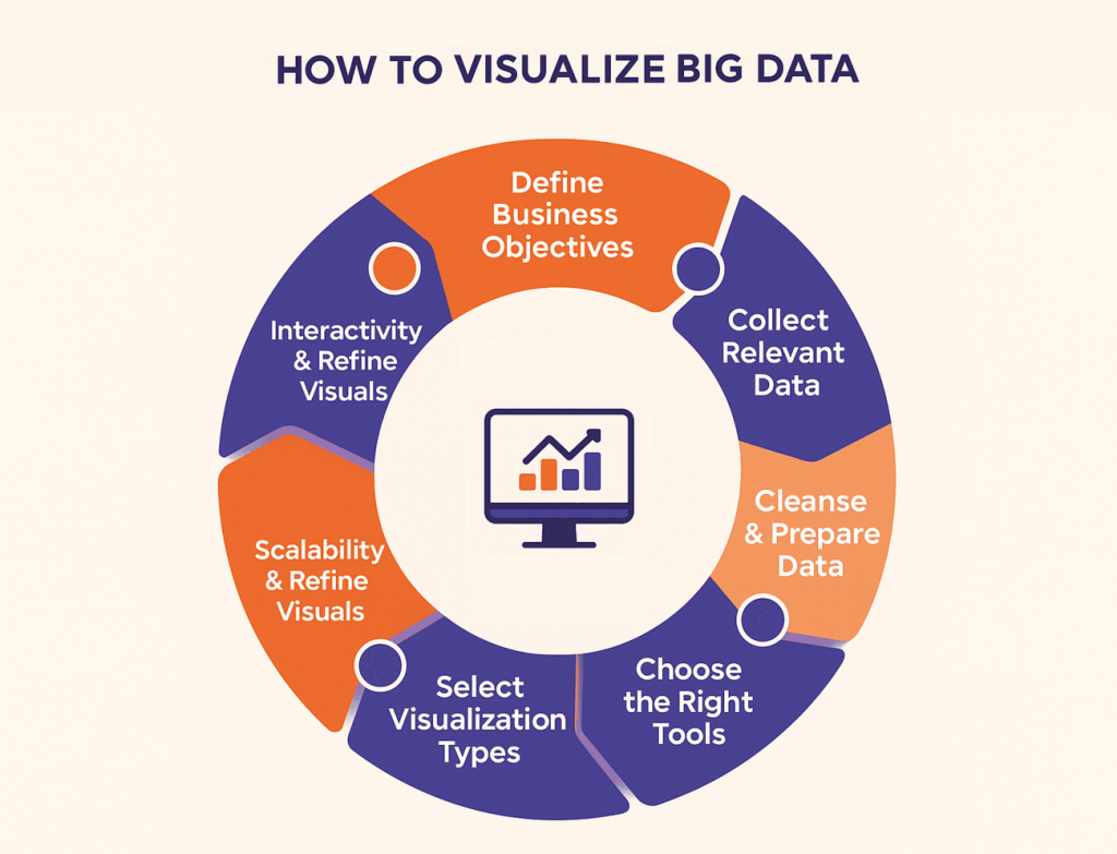
Step 1: Define Business Objectives
Start with purpose, not tools. Identify what decisions your visualizations will support and who will use them. Companies like Domino’s redefined their strategy by mapping decision points across operations and designing dashboards to guide each one in turning raw data into actionable insights.
Step 2: Collect Relevant Data
Determine which data sources matter most. CRM, ERP, IoT sensors, or analytics tools. Integrating these systems and tracking data lineage ensures accuracy in the visualization of big data, revealing how information flows across the organization.
Many modern data platforms simplify this process by enabling seamless data collection and unification across sources.
Step 3: Cleanse and Prepare Data
Clean data drives reliable insights. Resolve duplicates, inconsistencies, and missing values using data transformation techniques and tools like Informatica or Alteryx. Data preparation often consumes the majority of the project time, but it prevents the creation of misleading visuals later.
Step 4: Choose the Right Tools
Select tools aligned with your team’s skills and scale. Tableau and Power BI simplify design for business users, while Apache Superset or D3.js suit technical teams needing customization.
Step 5: Select Visualization Types
Match visuals to objectives: line charts for trends, bar charts for comparisons, maps for location-based data, and treemaps for hierarchical insights. Choosing the correct data visualization techniques ensures a meaningful storytelling experience that aligns with business goals and user needs.
Step 6: Ensure Scalability & Performance
Optimize data for speed and responsiveness. Aggregation, caching, and in-memory computing enable extensive dashboards to load instantly, even at enterprise scale.
Step 7: Add Interactivity & Refine Visuals
Interactive dashboards enable users to explore data through filters and drill-down capabilities. Refine designs based on honest user feedback, transforming static charts into dynamic big data analytics visualizations that drive continuous learning and smarter decisions.
7 Big Data Visualization Tools Compared (Free & Paid)
Choosing between these tools depends less on feature checklists and more on your organization’s specific context. Tableau’s market dominance means finding experienced users is easier. Power BI’s Microsoft integration means it might already be available through existing licenses. Open-source options eliminate licensing costs but increase support burden.
| Tool | Best For | Pricing Model | Key Strengths | Limitations |
| Tableau | Enterprise business users | Starts at $70/user/month | Intuitive interface, extensive visualization types, strong community | Can be expensive at scale and requires a separate Tableau Prep for data preparation. |
| Power BI | Microsoft ecosystem organizations | $10-$20/user/month | Tight Office integration, competitive pricing, and regular updates | Less intuitive than Tableau, with performance issues with very large datasets |
| Qlik Sense | Self-service analytics | Custom enterprise pricing | Associative data model, strong governance, mobile capabilities | Steeper learning curve, higher initial costs |
| Google Looker Studio | Small to mid-size teams | Free for basic use | No cost barrier, easy sharing, good for Google data sources | Limited for complex analysis, performance constraints with large data |
| D3.js | Custom visualization development | Free (open source) | Complete customization, web-native, endless possibilities | Requires JavaScript expertise, time-intensive development |
| Apache Superset | Technical teams seeking flexibility | Free (open source) | SQL-native, modern interface, growing community | Requires technical setup and maintenance, smaller ecosystem than commercial tools |
| Plotly | Python/R data science teams | Free to $99/user/month | Tight Python integration, publication-quality graphics, Dash for apps | Less business-user-friendly, requires programming knowledge |
How to Choose the Right Big Data Visualization Solution?
Selection criteria should reflect both current requirements and future direction, such as:
1. Define Business Goals & Data Needs
Strategic objectives drive tool requirements. If your goal is democratizing data access across non-technical teams, ease of use matters more than advanced capabilities. If you’re supporting data scientists building big data predictive analytics models, programmatic access and statistical functions take priority. Document specific use cases, what questions need answers, who’s asking, how often, and with what urgency.
2. Check Scalability & Compatibility
Technical requirements constrain choices. Does the tool integrate with your data sources without requiring custom development? Can it handle your data volumes without performance degradation?
Does it support your security and compliance requirements? Testing with representative datasets before committing is essential to avoid scalability issues that often arise during big data implementation, when growth exceeds the system’s limits.
3. Compare Costs & Licensing Models
Total cost of ownership extends beyond license fees. Include implementation costs, ongoing maintenance, training, and potential custom development. Per-user pricing seems straightforward until you need 500 users viewing dashboards. Enterprise licensing might cost more upfront, but it saves money at scale. Open-source tools eliminate licensing costs but require staff time for setup and ongoing support.
4. Assess User Skills & Ease of Adoption
Sophisticated tools that nobody uses create no value. Consider current team capabilities and willingness to learn new systems. Tableau succeeds partly because users can become productive within days. More powerful but complex tools face adoption challenges. Pilot programs reveal whether people actually embrace new tools or find workarounds.
5. Integration with Analytics & BI Tools
Visualization rarely exists in isolation. Integration with data science platforms, statistical packages, and business intelligence systems matters. Can your data scientists build models in Python and deploy them through visualization dashboards? Can you embed visualizations in existing applications? Seamless workflows between tools amplify value.
Partnering with experienced data visualization consulting services can help organizations design these integrations effectively, ensuring that visual tools align with both analytics infrastructure and business objectives.
6. Support, Security & Community
Enterprise deployments need vendor support when issues arise. Community resources provide solutions to common problems. Security features protect sensitive data. Compliance certifications enable regulated industry use. Evaluate vendor stability. Startups might offer innovation, but they carry a higher risk than established players.
Top 4 Key Challenges in Visualizing Big Data
Implementing big data visualization is not just about creating charts, but it’s about managing the immense scale, diversity, and complexity of data. Understanding these challenges early enables organizations to plan effectively and achieve reliable, insightful outcomes.
1. Data Volume & Variety
Handling billions of records in real time stretches most visualization tools beyond their original design limits. Modern visualization of big data involves integrating structured, semi-structured, and unstructured sources such as transaction logs, social media feeds, and IoT sensors. Balancing data completeness with performance often requires strategies such as aggregation or sampling, but these trade-offs can impact accuracy.
2. Scalability & Performance
Business users expect dashboards to load instantly, even when backed by massive datasets. Achieving this demands a well-architected infrastructure, including in-memory databases, optimized queries, and smart caching. Without scalability planning, big data analytics visualization projects often fail to meet performance expectations once scaled to production.
3. Data Quality & Accuracy
Visuals can exaggerate errors if the underlying data is inconsistent or incomplete. A slight inaccuracy in source data can appear as a significant trend shift when visualized. Strong data governance best practices and validation checks, along with quality monitoring, are crucial for maintaining trust in analytics outputs.
4. Complexity for Non-Technical Users
While self-service analytics empowers teams, it also introduces challenges. Many users select unsuitable chart types or misinterpret the relationships between data. Simplified interfaces, guided templates, and proper training can bridge this gap, ensuring that big data visualization serves insights, not confusion.
Best Practices for Visualization of Big Data
Creating an effective visualization of big data requires more than just technical tools; it demands strategic design, scalability, and trust in the underlying data. By following these best practices, organizations can transform the visualization of big data into a strategic advantage in bridging the gap between information overload and intelligent action:
1. Select Appropriate Visualization Types
Not every chart fits every story. Select visualization types that align with your objectives and data relationships. Use line charts for trends, bar charts for comparisons, maps for spatial insights, and scatter plots for correlations. The goal is to highlight patterns, not overwhelm users with unnecessary visuals.
2. Ensure Scalability
As data grows, performance can suffer. Build systems that can scale both horizontally (across multiple servers) and vertically (within a single system). Utilize distributed computing, in-memory analytics, and query optimization to maintain responsive dashboards, even when handling billions of data points.
3. Integrate AI & ML
Artificial intelligence and machine learning enhance big data visualization by automating pattern detection and predictive insights. Instead of static reports, users can interact with adaptive dashboards that identify anomalies, forecast trends, and suggest next steps to turn visualizations into proactive decision-making tools.
With AI data extraction, organizations can automatically pull valuable insights from complex and unstructured sources, enriching visual analytics with deeper, real-time context.
4. Prioritize Clarity & Storytelling
Effective visualization communicates a narrative. Use consistent color schemes, clear labeling, and logical flow to guide interpretation. Avoid visual clutter and highlight the “why” behind the numbers in helping stakeholders connect insights to business outcomes.
5. Strengthen Data Governance
Accuracy underpins credibility. Establish robust data governance policies to ensure the information visualized is timely, validated, and compliant with privacy standards. Transparent data lineage builds confidence, ensuring users trust what they see.
Strong governance also enhances big data and knowledge management, enabling organizations to turn raw information into structured insights that can be shared, reused, and scaled across teams.
Implementing Big Data Visualization: When to Seek Expert Help?
While many organizations start small with in-house tools, scaling big data visualization to an enterprise level often demands specialized expertise.
The challenges lie not only in creating dashboards but also in integrating a big data pipeline, ensuring real-time performance, and maintaining data accuracy at scale.
You may need expert support when:
- Your visualizations lag or fail when working with large data volumes.
- Data from different systems (e.g., IoT, ERP, CRM) isn’t smoothly connected.
- Teams struggle to interpret visual reports or trust the underlying data.
- You’re ready to move beyond descriptive analytics toward predictive and prescriptive insights.
This is where Folio3 Data Services can make a significant difference. With deep experience in data engineering, analytics, and visualization, Folio3 helps businesses build end-to-end data ecosystems that encompass everything from ETL pipelines to interactive dashboards powered by platforms such as Power BI, Tableau, and Snowflake.
Through its Snowflake consulting services, Folio3 enables organizations to optimize data storage, scalability, and performance for advanced analytics.
Our experts ensure that your visualizations aren’t only visually appealing but also strategically aligned with your business goals. Whether it’s optimizing performance, integrating AI-driven analytics, or improving data governance, Folio3 provides the framework and expertise needed to transform raw data into real-time intelligence.
Partnering with the right experts ensures your big data visualization efforts drive measurable results—clearer insights, faster decisions, and smarter growth.
5 Common Big Data Visualization Mistakes to Avoid
Learning from others’ mistakes is often less expensive than making your own. Here is some of the common mistakes to avoid:
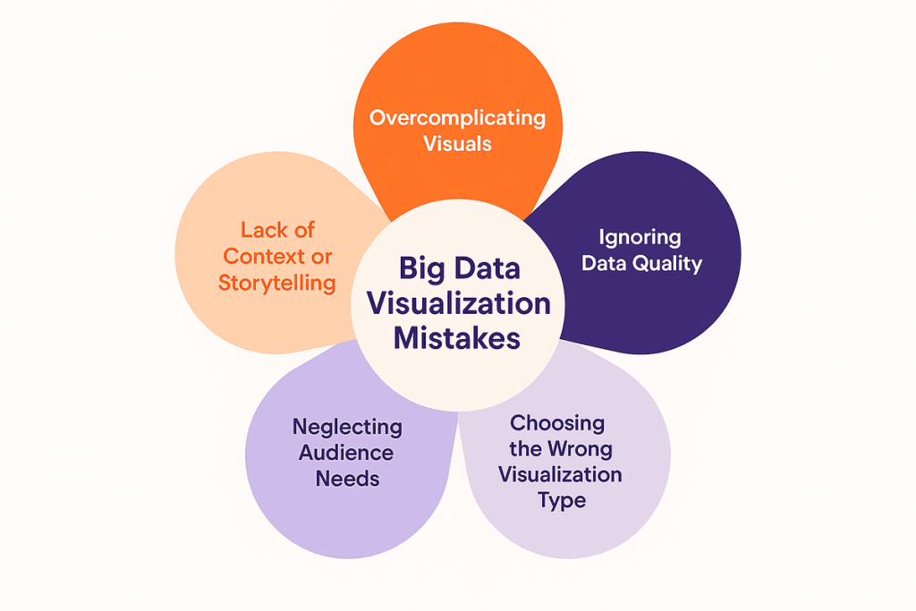
Mistake 1: Overcomplicating Visuals
More information does not necessarily equal a better understanding. Dashboards crammed with every possible metric overwhelm rather than inform. Color schemes with ten different hues create confusion about what matters. Three-dimensional charts that look impressive but distort values mislead viewers. Simplicity requires discipline—deciding what to exclude is harder than including everything.
Mistake 2: Ignoring Data Quality
Beautiful visualizations of inaccurate data can create confident, yet incorrect, decisions. Organizations often rush to visualization without ensuring data reliability. Missing values, duplicates, inconsistent formats, and stale information all corrupt insights.
Even when working with big data platforms, poor data governance can compromise the entire visualization process.
Partnering with data integration consulting services can help organizations streamline data pipelines and maintain consistency across sources.
Data quality isn’t glamorous, but it’s foundational. Allocating time for data validation prevents problems that are much harder to fix after dashboards are in production.
Mistake 3: Choosing the Wrong Visualization Type
Pie charts comparing ten categories are frustrating rather than informative. Line charts connecting unrelated categorical data can be misleading. Three-dimensional effects that obscure actual values sacrifice accuracy for aesthetics. Each visualization type has appropriate uses and common misuses. Taking the time to match the format to the data and question pays dividends in clarity.
Mistake 4: Neglecting Audience Needs
Dashboards designed for what data you have, rather than what decisions users need to make, gather dust. Technical teams build visualizations that showcase their technical capabilities, while business users struggle to find answers to their questions.
A well-defined data analytics framework ensures that visualizations align with business goals, audience needs, and decision-making processes. Different audiences require different information presented in different ways. Executives want high-level trends, while analysts need detailed drill-downs.
Mistake 5: Lack of Context or Storytelling
Numbers without context lack meaning. Showing current sales without comparison to targets, prior periods, or competitors leaves viewers uncertain about whether the performance is good or bad. Effective visualizations provide the context needed for interpretation, baselines, benchmarks, targets, and trend lines that help viewers understand not only what the numbers represent, but also what they mean.
Measuring the ROI of Big Data Visualization
The value of big data visualization lies in its measurable impact on decision-making, efficiency, and growth. Here’s how organizations can evaluate their return on investment (ROI):
Improved Decision-Making
Clear, real-time visual insights enable faster and more accurate decisions. When leaders can interpret trends instantly, they transition from reactive to proactive strategies, minimizing risks and capitalizing on emerging opportunities — one of the core business intelligence benefits that drive strategic agility.
Increased Operational Efficiency
Visualization tools streamline processes by identifying bottlenecks and inefficiencies across departments, enabling more effective management. Teams spend less time gathering and cleaning data and more time analyzing it, resulting in better productivity and reduced operational costs.
Revenue Growth & Cost Savings
With more precise forecasting and performance tracking, businesses can allocate resources effectively, identify profitable opportunities, and reduce waste. Many organizations see tangible financial gains within months of implementation.
Enhanced Customer Insights
Big data visualization brings customer behavior, preferences, and engagement patterns to life in helping businesses personalize experiences, improve retention, and strengthen brand loyalty.
Future Trends in Big Data Visualization
As data ecosystems evolve, so do the ways we visualize and interact with information. Understanding emerging trends helps organizations stay ahead and prevent technological obsolescence.
AI-Powered Visualization
Artificial intelligence is transforming data visualization from a manual process to an automated, intelligent system. Platforms like Tableau’s Ask Data and Power BI’s Q&A now allow users to ask questions in plain language and instantly receive visual insights.
When integrated with enterprise search AI, these tools can surface relevant information across vast datasets, detect anomalies, and uncover hidden correlations, making analytics more intuitive and accessible to non-technical users
Augmented and Virtual Reality (AR/VR)
Immersive visualization is becoming a reality. VR enables analysts to explore 3D data landscapes, uncovering patterns invisible in flat displays. Meanwhile, AR overlays live data on physical environments such as inventory or machinery performance data to enhance on-site decision-making.
These same visualization principles are now being applied in AI video surveillance, where real-time visual analytics help detect patterns, monitor environments, and improve operational safety through intelligent data interpretation.
Real-Time and Streaming Visualization
With technologies like Apache Kafka, organizations can process and visualize data streams in real time. Through effective real-time data integration, these visualizations combine information from multiple live sources such as transactions, sensors, and user interactions to deliver instant insights.
This enables fast-paced industries such as finance, logistics, and fraud detection to make split-second decisions where even seconds can define success.
Natural Language Processing (NLP)
NLP-driven visualization tools enable users to interact conversationally with data, eliminating the need for manual queries or complex dashboards. This democratizes analytics, allowing broader access to data-driven decision-making.
Advanced Interactivity
Static dashboards are evolving into interactive, collaborative environments. Users can manipulate data, test scenarios, and share insights smoothly across devices, making visualization a continuous and integrated part of everyday business operations.
FAQs
What is big data visualization, and why is it important?
Big data visualization converts massive, complex datasets into visual insights that reveal patterns and trends. It’s crucial for turning overwhelming data into actionable intelligence and driving informed decisions.
What’s the difference between big data visualization and traditional data visualization?
Traditional data visualization handles smaller, structured data, while big data visualization manages vast, unstructured datasets. It uses advanced tools and infrastructure to ensure performance and scalability.
How do big data and data visualization work together?
Big data provides large-scale raw information, while data visualization translates it into clear, actionable insights. Together, they enable faster, smarter decision-making across all business functions.
What types of visualizations are best for big data?
The best big data visualizations include heat maps, time-series charts, network graphs, and interactive dashboards. Each helps uncover trends, relationships, and patterns in large, diverse datasets.
What are some real-world big data visualization examples?
Companies like Netflix, UPS, and healthcare providers utilize big data visualization to analyze user behavior, optimize logistics, and monitor operations in real-time for improved performance.
Which are the best big data visualization tools?
Top big data visualization tools include Tableau, Power BI, Qlik Sense, Apache Superset, and D3.js. Each offers unique strengths in usability, scalability, and customization.
How much do big data visualization tools cost?
Big data visualization tools typically cost $10–$70 per user per month, while open-source options are free but require setup and ongoing maintenance. Costs vary depending on the scale and technical needs.
Can small businesses use big data visualization?
Yes, big data visualization is accessible to small businesses through affordable tools like Power BI and Looker Studio, enabling them to uncover customer trends and enhance their performance.
How can businesses choose the right big data visualization solution?
Select a big data visualization tool based on business goals, scalability, budget, and integration needs. Pilot testing ensures the tool aligns with real-world workflows and data types.
What are the challenges in big data analytics visualization?
Big data visualization faces challenges like data quality, scalability, and performance optimization. Overcoming these requires strong governance, architecture, and user-friendly design.
What skills are needed for big data visualization?
Effective big data visualization requires technical expertise, analytical thinking, design sensibility, and business domain knowledge to create impactful, data-driven stories.
What is the future of big data visualization?
The future of big data visualization lies in AI automation, real-time analytics, AR/VR experiences, and NLP-driven insights that make data interaction faster and more intuitive.
Conclusion
Big data visualization transforms overwhelming information into practical insights, enabling organizations to identify trends, predict risks, and make smarter decisions more quickly. Success depends on the strategic implementation of visualization tools that align with business goals, user needs, and a scalable data architecture.
Companies that integrate visualization into daily operations gain a lasting competitive edge through faster, data-driven decision-making. To experience the full potential of your data, partner with Folio3 Data Services.
Our experts design and implement custom big data visualization solutions that transform raw information into meaningful insights in driving efficiency, innovation, and growth across your business.