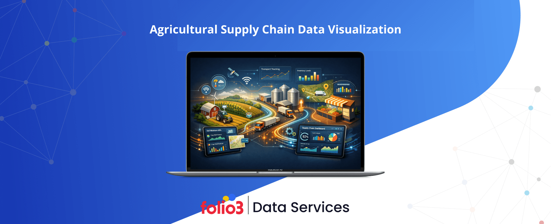

Visualizing agricultural supply chain data means turning complex, fast-moving information—from fields and fleets to factories and retailers—into intuitive, interactive views that drive better decisions. Done right, these visuals bridge data silos, spotlight risks earlier, and align actions across teams. This guide shows how to connect your data sources, choose the right charts, and establish role-based dashboards that move your organization from reactive reporting to proactive, ROI-focused decision-making. We cover implementation steps, tool selection, and AI integration, with practical tables and examples designed for leaders who need clarity now.
Agricultural Supply Chain Visualization Explained
Agricultural supply chain visualization is the strategic use of charts, maps, and interactive dashboards to map, monitor, and analyze flows of inputs, crops, livestock, and finished goods from field to consumer. The agricultural context is uniquely complex: upstream data spans agronomy, weather, planting, harvesting, and procurement; downstream data covers processing, storage, logistics, and retail quality. Visualization brings this together by unifying telemetry from IoT sensors, drones, and satellites with ERP transactions, fleet and cold chain feeds, and certification/traceability records. The result is faster insight, shared context, and better decisions across roles—from farm managers to compliance leaders—when paired with disciplined data practices and user-centered design, as outlined in industry guidance on agricultural visualization benefits and design principles (see Folio3 Data perspective in this overview of data visualization in agriculture).
Benefits of Visualizing Agricultural Supply Chain Data
The business case is compelling. Executives and data leaders adopt agricultural supply chain data visualization solutions built on modern data visualization platforms to:
- Strengthen traceability and risk mitigation by linking lots, locations, and handlers end-to-end.
- Optimize resources (water, fuel, labor) and reduce losses with anomaly detection and targeted interventions.
- Lead in sustainability by tracking carbon footprints, water use, and certifications—translating complex ESG data into defensible, auditable metrics that customers and regulators can trust, an approach highlighted in practical agricultural supply chain solution playbooks.
- Deliver tangible outcomes:
- Higher forecast accuracy and inventory turns
- Lower spoilage via cold chain monitoring and alerting
- Faster, cleaner compliance reporting
- Stronger consumer trust through immutable, blockchain-backed records
Role-specific wins:
- Procurement: Supplier performance scorecards, price/volume variance trends, and contract compliance.
- Fleet and logistics: Route adherence maps, cold chain heatmaps, and on-time delivery tracking.
- Quality and food safety: Lot genealogy, lab results dashboards, and recall readiness drills.
- Sustainability: Emissions and water intensity dashboards, certificate status tracking, and hotspot analysis.
Key Data Sources for Agricultural Supply Chain Visualization
Effective visualization starts with an inventory of core data domains and the systems behind them. Key sources include:
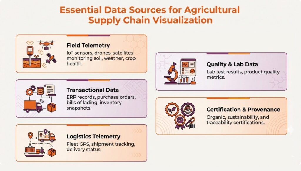
- Field telemetry: IoT sensors (soil moisture, temperature), drones, and satellites. Satellite indices such as NDVI, the Normalized Difference Vegetation Index, enable near real-time crop health monitoring.
- Transactional data: ERP and procurement records, purchase orders, bills of lading, inventory snapshots.
- Logistics telemetry: Fleet GPS, telematics, cold chain IoT, warehouse automation logs.
- Quality and lab data: Microbiological and chemical test results, grading, and specification compliance.
- Certification and provenance ledgers: Supply chain traceability systems and blockchain modules anchoring chain-of-custody events.
Sample data catalog for quick planning:
| Data source | What it includes | Frequency | Example streams | High-value use cases |
| Field telemetry | Soil moisture, temperature, NDVI, weather | Real-time to daily | IoT gateways, satellite tiles | Irrigation optimization, yield risk alerts |
| Transactional (ERP/procurement) | Purchase orders, receipts, inventory, costs | Daily to weekly batch | ERP exports, EDI | Demand-supply balancing, COGS analysis |
| Logistics telemetry | GPS, speed, geofences, reefer temperatures | Real-time | TMS/telematics APIs | On-time delivery, spoilage prevention |
| Quality and lab | Grading, contamination, specifications | Batch per lot | LIMS, QC apps | Recall readiness, supplier quality |
| Traceability ledgers | Chain-of-custody events, certificates | Event-driven | Blockchain/traceability systems | Provenance, compliance audit trails |
| Digital twins | Virtualized fields/operations | Event + batch | Sensor fusion, models | Scenario testing, resource planning |
Essential Visualization Techniques and Chart Types
Choosing the right visual form accelerates insight capture and action. Applying proven data visualization techniques ensures stakeholders can interpret trends and act confidently:
- Line charts reveal time-series trends such as yields, temperatures, and fuel use—ideal for spotting seasonality and drift.
- Choropleth and point maps show geospatial risks, stock locations, or service levels by region.
- Sankey diagrams illustrate flows—material, energy, or units—between stages and are excellent for mapping shrink, rework, or grade transitions across nodes.
- Treemaps display hierarchical proportions (e.g., product-family contributions to variance) with nested rectangles for quick comparisons.
- Heatmaps highlight anomalies in cold chain temperatures or quality metrics across lots and lanes.
- Interactive dashboards provide role-based access, filters, and drill-through for scenario exploration and what-if analyses.
Quick chart selection guide:
| Chart type | Definition | Best-fit use cases | Sample ag data |
| Line chart | Value over time | Trend, seasonality, drift | Yield/day, reefer temp/hour |
| Map (choropleth/point) | Values by location | Risk hotspots, coverage | On-time delivery by region |
| Sankey diagram | Flow between stages | Loss/shrink mapping | Harvest → packhouse → retail volumes |
| Treemap | Hierarchical proportions | Mix, contribution analysis | SKU/category margin impact |
| Heatmap | Intensity across a matrix | Anomaly detection | Lane x day temp excursions |
| Interactive dashboard | Linked visuals + filters | Multi-role decisions | Supplier + route + quality views |
For an overview of supply chain visualization best practices and chart selection logic, see this concise guide to effective supply chain visuals.
Step-by-Step Guide to Implementing Agricultural Supply Chain Visualizations
A pragmatic lifecycle helps teams deliver value early—and scale with confidence.
- Define scope, governance, and stakeholders
- Audit and ingest priority data
- Design a scalable data architecture
- Select visualization tools and templates
- Prototype with end users
- Integrate traceability and compliance features
- Operate, monitor, and iterate visualizations
1. Defining Scope, Governance, and Stakeholders
Start with a supply chain map by commodity and geography. Document chain-of-custody models—Identity Preserved, Segregation, Mass-Balance, and Book & Claim—and the data owners for each node. Establish a clear governance charter covering data standards, access controls, and stewardship across farmers, suppliers, logistics partners, and compliance functions, guided by reputable traceability frameworks.
2. Auditing and Ingesting Relevant Data
Inventory telemetry (IoT, drones, satellites), transactional (ERP/procurement), lab/quality, and remote sensing sources. Prioritize high-signal feeds that directly impact outcomes—reefer temperatures for spoilage prevention or NDVI for crop risk. Standardize and clean early: harmonize units, timestamps, and IDs; resolve master data; and plan for change data capture. Practical methods to overcome agricultural data silos—especially during manual-to-digital transitions—require strong big data engineering expertise to ensure robust ingestion and integration pipelines.
3. Designing a Scalable Data Architecture
Adopt layered storage: raw/staging for ingestion, curated warehouses for analytics, time-series stores for IoT, and geo-databases for spatial data. Use event streaming for real-time telemetry and batch pipelines for ERP and historical loads. Expose APIs for data integration in supply chain, connecting traceability and blockchain components to support immutable provenance. Cloud platforms such as Folio3 Data with Snowflake, Databricks, and BigQuery provide elasticity and performance for both streaming and batch workloads.
4. Selecting Visualization Tools and Templates
Match tools to users, data complexity, and budget:
- Tableau and Power BI excel at dashboards and operational reporting; Power BI often aligns well with Microsoft-centric stacks.
- Qlik’s associative engine supports flexible exploration; Kinaxis focuses on scenario planning; SAS Viya brings advanced analytics and model governance.
Tool selection insights are summarized in this current roundup of supply chain analytics platforms. Note that Tableau is widely praised for rich interactivity but performs best with well-modeled, clean data, a point echoed in comparative analyses. For organizations standardizing on Microsoft, expert Power BI consulting can accelerate adoption and governance.
Quick comparison:
| Tool | Ideal users/use cases | Integration strengths | Usability | Relative cost |
| Tableau | Analysts, business users; interactive BI | Broad connectors, visuals | High | $$$ |
| Power BI | Enterprise self-serve; Microsoft shops | Deep Microsoft integration | High | $$ |
| Qlik | Exploratory analysis across silos | Associative engine | Medium–High | $$$ |
| Kinaxis | Supply planning, scenarios | ERP/TMS integrations | Medium | $$$$ |
| SAS Viya | Advanced analytics + governance | ML/AI pipelines | Medium | $$$ |
5. Prototyping with End Users
Co-create with the people who will use the insights. Run short, hands-on sprints with farmers, procurement managers, logistics coordinators, quality teams, and sustainability leads to shape dashboards, filters, and drill paths. Validate with task-based usability tests: Can a planner spot a risk and act in under a minute? Are alerts clear and actionable? Collaborative prototyping and fast iteration are core to successful agricultural BI rollouts, and designing around a strong big data visualization architecture ensures dashboards scale efficiently with growing data volumes.
6. Integrating Traceability and Compliance Features
Build trust into every view. Embed traceability events and, where appropriate, blockchain hashes to anchor immutable product histories from farm to shelf, a capability widely cited in agricultural supply chain solution playbooks. Protect privacy with role-based access and data minimization, and follow established traceability guidelines for consent, data ownership, and farmer feedback loops.
7. Operating, Monitoring, and Iterating Visualizations
Operationalize with SLAs, observability, and feedback cycles:
- Instrument KPIs: on-time delivery, spoilage rate, forecast accuracy, supplier OTIF, and carbon footprint.
- Automate threshold-based alerts and role-specific notifications.
- Schedule quarterly reviews to retire low-value widgets, add new signals, and align visuals with evolving regulations and business priorities.
For program structure ideas, see our data analytics framework for governing roadmaps at scale.
Best Practices for Effective Agricultural Supply Chain Visualization
- Start with the decisions, not the data. Anchor visuals to the few moments that change outcomes (e.g., reroute to save a load).
- Ship small, then scale. Launch minimal dashboards that solve one problem well; expand once adoption is proven.
- Pair great visuals with great data prep. Clear data models, conformed dimensions, and governed metrics matter as much as chart design. Engaging professional data visualization services can help ensure dashboards are both actionable and user-friendly.
- Balance granularity and clarity. Real-time overlays can overwhelm; use alerts for exceptions and roll-ups for context.
- Respect privacy and ownership. Apply least-privilege access, anonymize where needed, and honor consent agreements across the network.
Balancing Real-Time and Batch Data for Optimal Insights
Real-time data shines for cold chain integrity and fleet routing, where minutes matter; batch data is best for trend analysis, cost-to-serve, and seasonal planning. The right mix supports both fast response and long-horizon optimization.
| Data type | Typical latency | Best visualizations | Decision horizon | Common triggers |
| IoT cold chain telemetry | Seconds–minutes | Heatmaps, alert tiles, route maps | Immediate | Temp excursion alert |
| Fleet GPS/telematics | Seconds–minutes | Live maps, ETA boards | Same-day | Geofence breach |
| Field sensors/NDVI | Hourly–daily | Line charts, choropleths | Days–weeks | Drought or stress signal |
| ERP/procurement | Daily–weekly | Treemaps, trends, variance | Weeks–quarters | Demand shift |
| Quality/lab results | Batch per lot | Lot genealogy, control charts | Days–weeks | Out-of-spec lot |
For architecture patterns that enable real-time capture and action, explore our guidance on real-time data collection and streaming analytics.
Driving AI and Predictive Analytics with Advanced Visualization
Predictive analytics in agriculture uses statistical and machine learning models to forecast yields, demand, and disruptions by combining historical and real-time signals. Examples include satellite- and sensor-powered yield forecasting to right-size logistics capacity, and digital twins in farming to optimize inputs, timing, and throughput before making physical changes. When AI outputs—forecasts, risk scores, recommended actions—are embedded in dashboards with scenario sliders and confidence bands, teams can stress-test plans, mitigate risk, and allocate resources with greater precision. These approaches increasingly complement generative AI in supply chain management, where AI-driven recommendations help planners explore alternative scenarios faster. Explore how to operationalize these capabilities in predictive analytics use cases.
Overcoming Data Governance and Privacy Challenges
Data governance is the framework of roles, processes, and controls that keeps data accurate, secure, and responsibly used across its lifecycle. In multi-stakeholder agricultural networks, establish stewardship, data standards, lineage, and access controls aligned to traceability guidelines and consent policies. Address regulations such as GDPR and regional data rights by minimizing PII, enforcing role-based access, and maintaining auditable trails of who accessed what and why. Practical steps for aligning governance with traceability include stakeholder mapping, clear data ownership, and phased rollout with feedback mechanisms. These practices mirror approaches seen in healthcare supply chain analytics, where patient privacy and regulatory compliance are critical.
Case Studies in Agricultural Supply Chain Visualization Success
- Blockchain-backed produce provenance: A fresh produce exporter created a lot-level provenance dashboard tying harvest events, packhouse processing, logistics handoffs, and retail arrival to a tamper-evident ledger. This approach not only improved consumer trust metrics and sped up compliance reporting but also informed their broader retail supply chain visibility strategy, reducing recall simulation time from days to hours.
- Digital twins for proactive crop operations: A multinational row-crop operation fused satellite indices, IoT soil data, and agronomic models into a digital twin of fields and storage assets. Planners visualized yield forecasts and “what-if” input changes, reducing water use while improving on-time shipments. Outcome: fewer spoilage incidents, better load planning, and measurable efficiency gains across seasons.
Frequently Asked Questions
What are the common data challenges in visualizing agricultural supply chains?
Fragmented systems, inconsistent data standards, and variable data quality across partners make integration and trust difficult.
How to choose the right visualization tools for agricultural supply chain data?
Prioritize integration with your stack, scalability, cost, and ease of use; tools like Folio3 Data preferred offerings such as Tableau, Power BI, Qlik, Kinaxis, and SAS Viya can meet various needs.
How can visualization improve supply chain traceability and sustainability?
It clarifies product origins and chain-of-custody, exposes inefficiencies, and supports transparent, auditable ESG reporting that meets buyer and regulatory expectations.
What steps ensure successful adoption of supply chain data visualization?
Define outcomes, map governance, involve end users in design, ensure clean data, and iterate based on usage and feedback.
How does integrating AI enhance agricultural supply chain decision-making?
AI adds forecasts and risk alerts to dashboards, enabling scenario planning and faster, more confident decisions across planning and execution.
Conclusion
Visualizing agricultural supply chain data transforms complexity into clarity, turning scattered information streams into unified dashboards that drive measurable outcomes—from reduced spoilage and optimized logistics to faster compliance reporting and transparent sustainability tracking. Success requires more than choosing charts: it demands clean data foundations, the right mix of real-time and batch pipelines, governance that protects privacy across multi-stakeholder networks, and designs built around the decisions that matter most. Organizations that pair strong visualization tools with disciplined data practices unlock competitive advantages: better forecasts, proactive risk management, and the traceability that regulators and consumers increasingly expect.
Folio3 Data Services partners with agricultural enterprises to build end-to-end visualization solutions on modern cloud platforms like Snowflake and Databricks. From connecting IoT sensors and ERP systems to designing role-based dashboards and integrating blockchain-backed traceability, our team delivers scalable, compliant data architectures that meet the unique demands of farm-to-retail supply chains. Whether you’re launching your first dashboard or scaling predictive analytics across global operations, Folio3 Data brings proven expertise in agriculture, cloud engineering, and AI enablement to turn your supply chain data into actionable insights and lasting value.