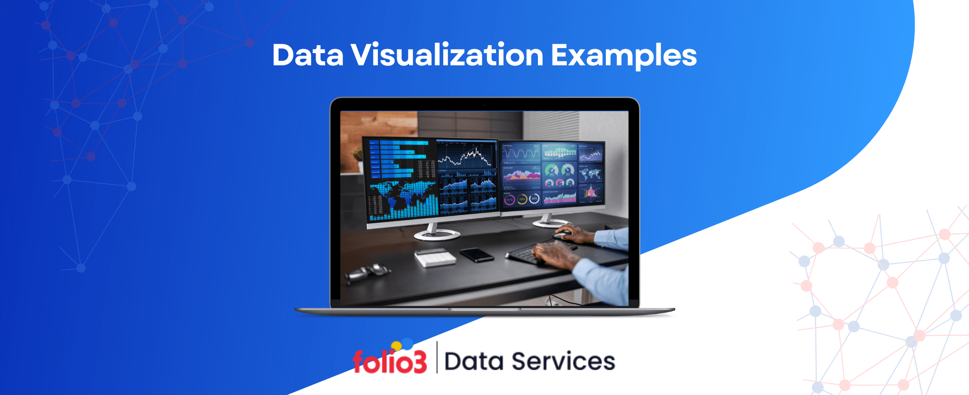

Data is growing at an unprecedented rate—by 2025, the world is expected to generate 181 zettabytes of data annually. However, raw data alone holds little value unless structured and understood. This is where data visualization examples transform complex datasets into clear, actionable insights.
Effective data visualization examples, such as interactive dashboards, heatmaps, and real-time graphs, help businesses, researchers, and decision-makers make sense of vast amounts of information.
This blog explores big data visualization examples, demonstrating how different visualization techniques simplify complex datasets for better analysis and decision-making.
What is Data Visualization?
Data visualization is the graphical representation of information and data. Visual elements like charts, graphs, and maps simplify complex datasets and make data more accessible for analysis and decision-making. It helps businesses, researchers, and analysts identify patterns, trends, and correlations that might go unnoticed in raw data.
Industry-Specific Data Visualization Examples
Data visualization is crucial in transforming raw numbers into meaningful insights. Various industries use data visualization examples to interpret large datasets, identify trends, and make informed decisions. Organizations across industries increasingly rely on data visualization tools and predictive analytics services to simplify data and drive business value.
Below, we explore the best data visualization examples from different sectors. These examples showcase how organizations simplify complex datasets to enhance efficiency and accuracy.
1. Finance & Investment
Candlestick Charts for Stock Market Analysis
Stock market professionals use candlestick charts to analyze price movements and predict trends. These charts display four key data points—open, close, high, and low prices—within a specific time frame.
Traders can identify bullish or bearish trends and make informed investment decisions by observing candlestick patterns. According to Bloomberg, nearly 80% of financial traders rely on candlestick patterns for technical analysis and risk assessment.
Portfolio Performance Dashboards
Investment firms and individual investors use portfolio performance dashboards to track asset allocation, returns, and risk factors. These dashboards integrate real-time data from multiple sources, offering a consolidated view of stocks, bonds, and other investments. Visual elements such as pie charts and line graphs make monitoring performance and rebalancing portfolios easier.
Many financial organizations also leverage data engineering services & solutions to design these dashboards, ensuring seamless integration, accuracy, and scalability.
2. Healthcare & Medicine
Patient Health Monitoring Dashboards
Hospitals and clinics use patient health monitoring dashboards to track vital signs, medication adherence, and overall health trends. These dashboards aggregate data from wearable devices, electronic health records (EHR), and medical tests, providing healthcare data insights that allow doctors to detect early warning signs of diseases and intervene proactively.
Medical Imaging Visualizations
Medical imaging techniques such as MRI, CT scans, and X-rays generate vast amounts of data that must be interpreted efficiently. Heatmaps and 3D visualizations help radiologists and doctors identify anomalies, tumors, or fractures more accurately.
3. Marketing & Sales
Customer Segmentation Dashboards
Marketers use customer segmentation dashboards to group consumers based on demographics, purchase history, and online behavior. These dashboards visualize patterns in customer preferences, allowing businesses to create targeted marketing campaigns that yield higher conversion rates. According to HubSpot, companies that implement customer segmentation see an increase of 14.6% in customer engagement.
Social Media Analytics Heatmaps
In social media analytics, heatmaps track engagement levels across different platforms. By visualizing user interactions, businesses can identify peak engagement times, trending content, and areas for improvement in marketing efforts.
4. E-commerce & Retail
Sales Conversion Funnels
E-commerce businesses use sales conversion funnels to track customer journeys from product discovery to final purchase. These visualizations help retailers identify bottlenecks, optimize checkout processes, and improve user experience to maximize conversions.
Inventory Heatmaps for Stock Management
Retailers rely on inventory heat maps to monitor stock levels, identify fast-moving products, and manage warehouse space effectively. Heatmaps use color-coded visuals to highlight areas with high or low stock levels, helping managers make quick replenishment decisions.
5. Manufacturing & Supply Chain
Logistics and Route Optimization Maps
Supply chain managers use route optimization maps to plan efficient delivery routes, minimize fuel consumption, and reduce shipping delays. These maps visualize real-time traffic patterns, delivery time estimates, and alternative routes.
Production Efficiency Tracking Dashboards
Manufacturers use production efficiency dashboards to monitor equipment performance, track downtime, and optimize resource allocation. These dashboards help identify inefficiencies and streamline manufacturing processes.
FAQs
What are the types of data visualization?
Types of data visualization include charts, graphs, maps, dashboards, diagrams, infographics, tables, and matrices, each serving different analytical needs.
Which of the following are examples of data visualization?
Examples include bar charts, line graphs, heatmaps, interactive dashboards, network diagrams, and geospatial maps used across various industries.
Is Excel a data visualization tool?
Yes, Excel is a data visualization tool that offers charts, pivot tables, and conditional formatting to help analyze and present data effectively.
What are the 5 Cs of data visualization?
The five Cs—Clarity, Context, Color, Consistency, and Creativity- ensure that visualizations are accurate, meaningful, and easy to interpret.
How is data visualization used?
It simplifies complex datasets, identifies patterns, tracks trends, and supports decision-making in fields like finance, healthcare, and marketing.
What are the two sources of data?
Primary data (collected firsthand through surveys and experiments) and secondary data (gathered from existing reports and databases) are primary sources.
Conclusion
Data visualization is a game-changer for businesses, transforming raw, complex datasets into clear, actionable insights. From finance and healthcare to marketing and supply chain management, visual representations like dashboards, charts, and maps help organizations identify trends, optimize operations, and make data-driven decisions.
As data grows exponentially, using advanced visualization tools is crucial for staying competitive. Folio3’s data analytics services provide AI-driven analytics, real-time dashboards, and customized solutions to help businesses unlock the full potential of their data.