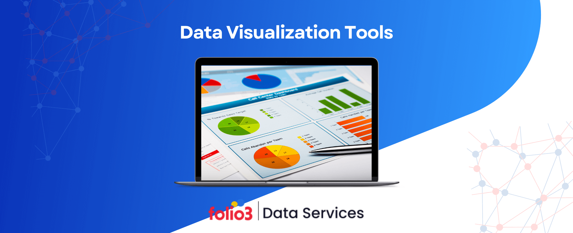

Data visualization has become an indispensable asset for businesses and analysts aiming to interpret complex data efficiently. By transforming raw numbers into visual formats, these tools enable quicker comprehension and more informed decision-making.
Content incorporating visuals like charts and graphs can boost readership by 80%. Furthermore, the global data visualization market is projected to reach $7.76 billion by 2023, reflecting a Compound Annual Growth Rate (CAGR) of 9.47%. This surge underscores the escalating demand for effective data visualization solutions.
Popular Data Visualization Software’s (Comparison)
This comprehensive overview will explore some of the top data visualization tools available today, examining their features, benefits, and how they cater to diverse analytical needs.
Choosing the right data visualization tool is just one part of building an effective data strategy. To get the most out of their data, businesses should pair these tools with reliable data analytics services. Adding predictive analytics services into the mix allows companies not only to understand what has happened but also to prepare for what’s ahead. Together, these services offer a complete approach to making smarter, well-informed business decisions.
1. Power BI
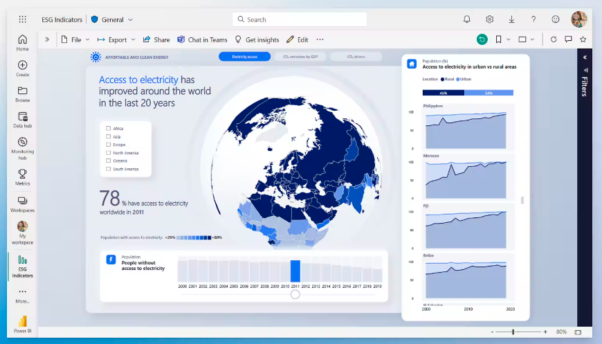
A powerful data visualization tool by Microsoft, Power BI offers interactive dashboards, real-time analytics, and seamless integration with Microsoft products. It is ideal for enterprises seeking advanced reporting capabilities. With robust AI-driven insights, it enhances business intelligence and decision-making.
Key Features
- Interactive Dashboards: Allows users to create dynamic dashboards that update in real-time, providing immediate insights.
- Data Connectivity: Supports connections to various data sources, including Excel, SQL databases, and cloud-based services.
- AI-Powered Insights: Utilizes artificial intelligence to detect patterns and provide predictive analytics.
Ease of Use
Power BI offers a user-friendly interface with drag-and-drop functionality, making it accessible to both technical and non-technical users. However, a learning curve may be involved in fully utilizing its advanced features.
Integrations
Seamlessly integrates with other Microsoft products such as Excel, Azure, and Teams, enhancing collaboration and data sharing.
Pricing
- Power BI Desktop: Free.
- Power BI Pro: $10 per user/month.
- Power BI Premium: $20 per user/month or $4,995 per capacity/month for large-scale deployments.
Best For
Organizations already utilizing Microsoft products seeking an integrated data visualization solution.
Pros
- Robust data modeling capabilities.
- Extensive data connectivity options.
- Cost-effective for small to medium-sized businesses.
Cons
- Premium pricing can be high for larger organizations.
- Advanced features may require technical expertise.
2. Tableau
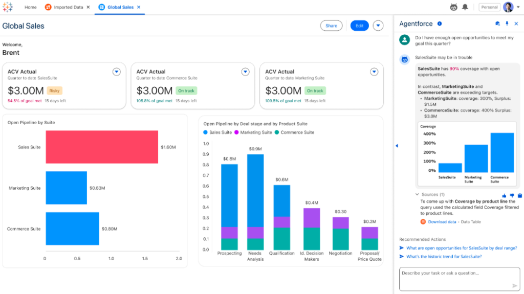
Tableau is a leading visual analytics tool known for its intuitive interface and deep analytical capabilities. It supports complex data analysis with dynamic dashboards and real-time collaboration.
Many organizations leverage Tableau consulting services to maximize their use of these features and ensure dashboards deliver actionable insights efficiently.
Key Features
- Interactive Visualizations: Enables the creation of a wide range of visual analytics, from basic charts to complex graphs.
- Real-Time Data Analysis: Allows users to analyze data on the fly, facilitating immediate decision-making.
- Collaboration Tools: Supports sharing and collaboration through Tableau Server and Tableau Online.
Ease of Use
Tableau is known for its intuitive interface, allowing users to create complex visualizations without extensive coding. However, mastering all its features may require time and training.
Integrations
It offers integrations with various data sources, including SQL databases, cloud services, and spreadsheets, which provides flexibility in data analysis.
Pricing
- Tableau Creator: $70 per user/month.
- Tableau Explorer: $35 per user/month.
- Tableau Viewer: $12 per user/month.
Best For
Organizations requiring advanced data visualization capabilities and interactive dashboards.
Pros
- Comprehensive visualization options.
- Strong community support and resources.
- Regular updates with new features.
Cons
- Higher pricing compared to some competitors.
- Performance can be affected with extremely large datasets.
3. Qlik Sense
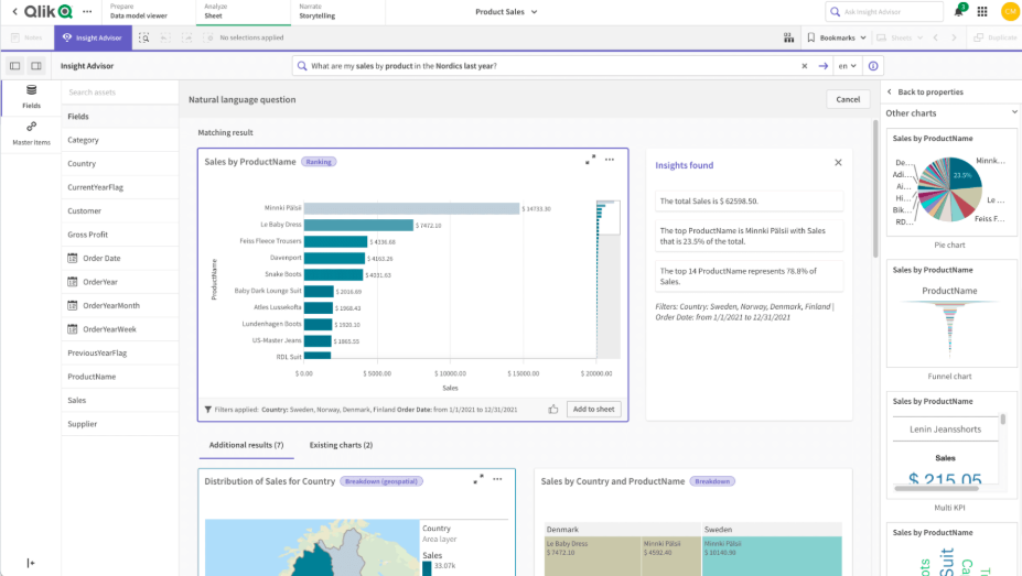
Qlik Sense offers AI-powered data visualization with an associative data model, enabling users to explore data dynamically. Its drag-and-drop interface makes it user-friendly for both technical and non-technical users. It is best suited for enterprises needing in-depth analytics and self-service BI.
Key Features
- Associative Data Model: Allows users to explore data freely without predefined queries, uncovering hidden insights.
- Self-Service Visualization: Empowers users to create their own visualizations and dashboards without relying on IT.
- Augmented Intelligence: Provides AI-generated insights and recommendations to enhance data analysis. With built-in data extraction AI, Qlik Sense can automatically pull and process information from multiple sources, enabling faster and more accurate analytics.
Ease of Use
Qlik Sense offers a user-friendly interface with drag-and-drop capabilities, making it accessible to users with varying technical skills.
Integrations
Supports integration with numerous data sources, including databases, cloud services, and third-party applications.
Pricing
- Qlik Sense Business: $30 per user/month.
- Qlik Sense Enterprise: Custom pricing based on organizational needs.
Best For
Organizations seeking a flexible, scalable data visualization solution with strong self-service capabilities.
Pros
- Innovative associative data model.
- Strong self-service and collaboration features.
- Scalable to large enterprise deployments.
Cons
- Customization can be complex.
- Pricing may be prohibitive for smaller organizations.
4. Infogram
Infogram specializes in creating visually engaging infographics, reports, and dashboards with interactive elements. Its ease of use and template-based approach make it ideal for marketers, journalists, and educators. The tool supports team collaboration and real-time data updates.
Key Features
- Template Library: This offers various customizable templates for infographics, reports, and dashboards.
- Interactive Maps and Charts: It provides tools to create interactive visualizations, enhancing user engagement.
- Collaboration Tools: Allows multiple users to work on projects simultaneously, facilitating teamwork.
Ease of Use
Infogram’s intuitive drag-and-drop interface makes it accessible to users without technical expertise, enabling them to quickly createent creation.
Integrations
It integrates with various platforms, including social media channels, cloud storage services, and marketing tools, streamlining data import and sharing.
Pricing
- Basic Plan: Free
- Pro Plan: $19 per month
- Business Plan: $67 per month
- Team Plan: $149 per month
Best For
Businesses and marketers looking for easy-to-use infographic and dashboard tools for visualizing data.
Pros
- It is a user-friendly interface with no coding required.
- A wide variety of templates and design options.
- Real-time collaboration features.
Cons
- Limited data integration capabilities compared to advanced data visualization tools.
- Some features are restricted in the free version.
5. ChartBlocks
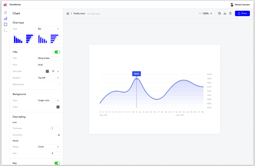
ChartBlocks is a cloud-based chart-building tool that allows users to create and share customizable visualizations effortlessly. It offers seamless data imports from various sources and is well-suited for quick, professional-looking data presentations. Best for individuals and small businesses needing simple yet effective visualizations.
Key Features
- Cloud-Based Platform: Allows users to create and store charts online without software installation.
- Customizable Charts: These offer extensive customization options for visual elements.
- Data Import Options: Supports data uploads from spreadsheets, databases, and live feeds.
Ease of Use
ChartBlocks provides an intuitive chart-building wizard, making it simple for users to create professional visualizations without extensive technical knowledge.
Integrations
Enables data import from CSV files, spreadsheets, and live data sources.
Pricing
- Free Plan: Limited features
- Personal Plan: $20 per month
- Professional Plan: $65 per month
Best For
Users looking for a simple yet flexible tool for generating quick visualizations.
Pros
- Easy-to-use chart builder with extensive customization.
- Cloud-based, requiring no software installation.
- Supports live data updates.
Cons
- Fewer advanced analytics features.
- Limited collaboration options.
6. Datawrapper
Datawrapper is a simple yet powerful tool for creating high-quality charts and maps, widely used by journalists and content creators. It requires no coding and ensures mobile-friendly, responsive designs. Ideal for quick data representation in media and publishing industries.
Key Features
- Simple Chart Creation: This tool is Ideal for generating bar, line, and pie charts quickly.
- Customizable Maps: Provides geographic visualization capabilities.
- Responsive Design: Ensures visualizations are optimized for different screen sizes.
Ease of Use
Datawrapper is straightforward, allowing users to create charts and maps with a few clicks. This makes it ideal for journalists and content creators.
Integrations
Supports CSV and Excel file uploads, with an API for automation.
Pricing
- Free Plan: Limited features
- Custom Plans: Pricing available upon request
Best For
Journalists, publishers, and content creators needing quick and professional data visualization.
Pros
- Easy to use with no coding required.
- High-quality output suitable for publishing.
- Interactive maps and charts.
Cons
- Limited analytical features.
- Fewer customization options than competitors.
7. Dundas BI
Dundas BI is an enterprise-grade business intelligence platform offering extensive customization and scalability. It supports advanced analytics, real-time dashboards, and deep data integrations. Best suited for large organizations requiring comprehensive data visualization and reporting.
Key Features
- Advanced Dashboards: Provides enterprise-level dashboard tools for visualizing data.
- Customizable Visualizations: Users can modify existing templates or create new visual elements.
- Data Connectivity: Supports numerous data sources, including SQL, Excel, and web services.
Ease of Use
While Dundas BI offers powerful features, it has a steeper learning curve due to its complexity.
Integrations
It integrates with databases, cloud services, and third-party applications.
Pricing
Custom pricing based on enterprise requirements.
Best For
Large enterprises needing an advanced data visualization platform.
Pros
- Highly customizable and scalable.
- Strong data integration capabilities.
- Comprehensive analytics features.
Cons
- Requires training to utilize features fully.
- Higher cost compared to more straightforward tools.
8. Zoho Reports (Zoho Analytics)
Zoho Analytics provides AI-driven insights, pre-built dashboards, and strong integrations with business applications. It is a cost-effective solution for SMBs looking for an easy-to-use yet powerful data visualization platform. Best for businesses seeking affordable and automated reporting.
Key Features
- AI-powered insights: Uses machine learning to analyze and interpret data.
- Pre-Built Visualizations: Includes ready-made dashboards for quick insights.
- Collaboration Tools: Allows teams to work together on reports and visualizations.
Ease of Use
Zoho Analytics offers a user-friendly interface with drag-and-drop features, making it accessible to business users.
Integrations
Seamlessly integrates with Zoho apps, Google Analytics, Salesforce, and other business tools.
Pricing
- Basic Plan: $24 per month
- Standard Plan: $48 per month
- Premium Plan: $115 per month
Best For
Small to medium businesses looking for an affordable yet powerful data visualization solution.
Pros
- AI-driven insights for better decision-making.
- Affordable pricing for businesses.
- Good integration with third-party applications.
Cons
- It may not have as many advanced analytics features as Tableau or Power BI.
- Some limitations in customization.
9. RAWGraphs
RAWGraphs is an open-source tool designed for unique and customizable data visualizations. It is highly flexible and supports complex data representation beyond standard charts and graphs. Best for designers, researchers, and developers looking for creative visualization options.
Key Features
- Open-Source: Free to use and modify for custom projects.
- Unique Data Visualizations: Provides creative chart options beyond traditional bar and pie charts.
- Export Options: Allows visuals to be exported in multiple formats, including SVG and PNG.
Ease of Use
RAWGraphs is developer-friendly but may require some coding knowledge to unlock its full potential.
Integrations
It supports data imports from spreadsheets and databases but lacks built-in business application integrations.
Pricing
Free (open-source software).
Best For
Researchers, designers, and developers looking for unique data visualization software.
Pros
- Completely free and open-source.
- Allows for highly customized visualizations.
- Ideal for academic and creative projects.
Cons
- Limited support and community compared to commercial tools.
- Requires some technical knowledge to utilize fully.
Conclusion
Choosing the right data visualization tools is crucial for transforming raw data into meaningful insights. Whether you need advanced data visualization tools like Tableau and Power BI or simple solutions like Infogram and Datawrapper, each platform offers unique advantages.
For businesses looking to streamline data analytics, Folio3’s data services provide end-to-end solutions, from integration to visualization. With expert support and latest technology, Folio3 helps organizations maximize their data visualization platforms for better decision-making and business growth. Reach out today!